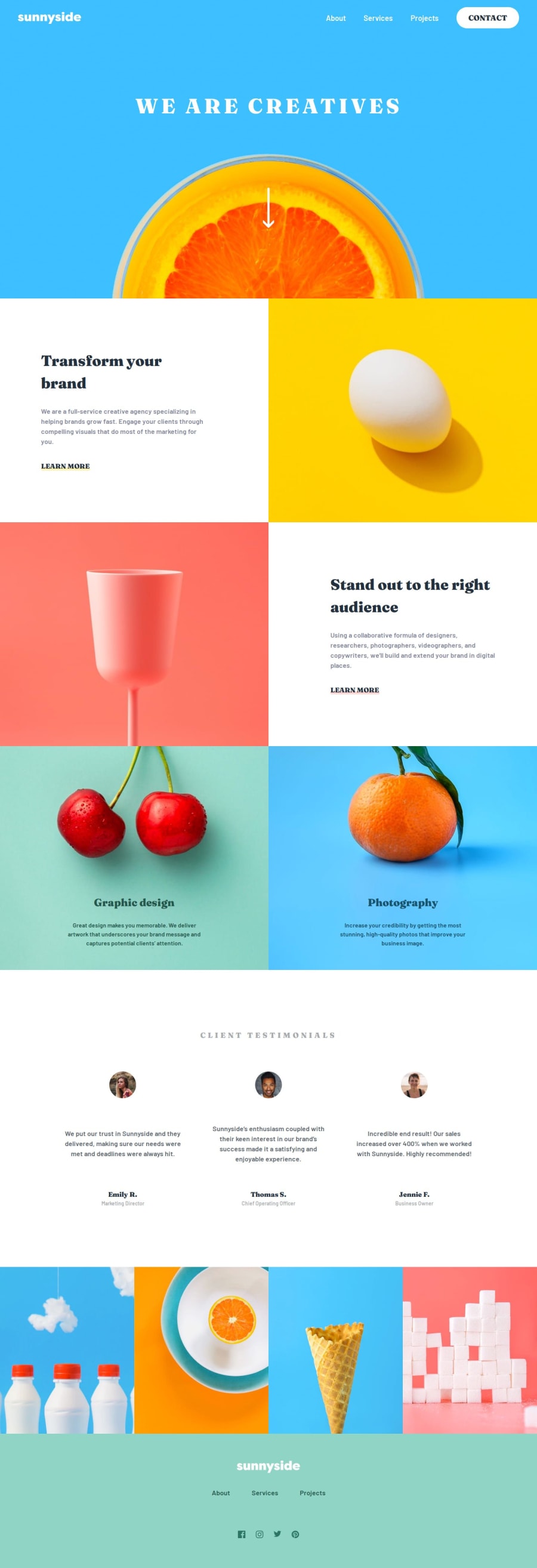
Sunnyside Landing Page
Design comparison
Solution retrospective
I wanted to do this because this challenge looks visually nice, but it took me longer than the e-commerce challenge—mostly due to my laziness and i used Figma file with a design credit. That caused me to focus a lot about spacing like text sizes and paddings, so i used a lot of clamp function.
I styled mostly without classes and used selectors like :has, >, etc. I added lots of comments for better readability, so if anyone checks the code, they won't be confused.
I saw a couple of people added skip to main content link to the arrow image but i added a few skip to main and footer links at top instead. Also aria labels, animation and transitions.
What specific areas of your project would you like help with?I tried using the tag for the modal in the final stage, but it caused styling issues that i couldn't fix, so i switched back.
Any feedback is appreciated. Please tell me anything to improve or if i missed something.
Community feedback
- @Grimm-NPosted 5 months ago
I'm thrilled as always! Honestly, I thought you’d be tackling the next challenge using Tailwind 🤔
0@KapteynUniversePosted 5 months agoHey @Grimm-N, I was thinking about using Tailwind for the Space Agency challenge to get used to it, but i don't like to use Tailwind or Bootstrap for big projects to be honest, because there are too many words that needs to be written in the HTML class.
I am also thinking about using React for the Product List with Cart challenge.
1@Grimm-NPosted 5 months ago@KapteynUniverse Honestly, I was just waiting to see how you’d do it because this framework makes my head spin, 😂😂😂
1 - @KapteynUniversePosted 5 months ago
Typo on the "What specific areas of your project would you like help with?"
I tried using the dialog tag for the modal
Oh looks like i missed footer logo color and looks like white backgrounds has a bit creamy color, changed it.
Background color broke the learn more link :D. Changed it back for the moment
Note to myself: Look for aria role nav and dialog
0
Please log in to post a comment
Log in with GitHubJoin our Discord community
Join thousands of Frontend Mentor community members taking the challenges, sharing resources, helping each other, and chatting about all things front-end!
Join our Discord
