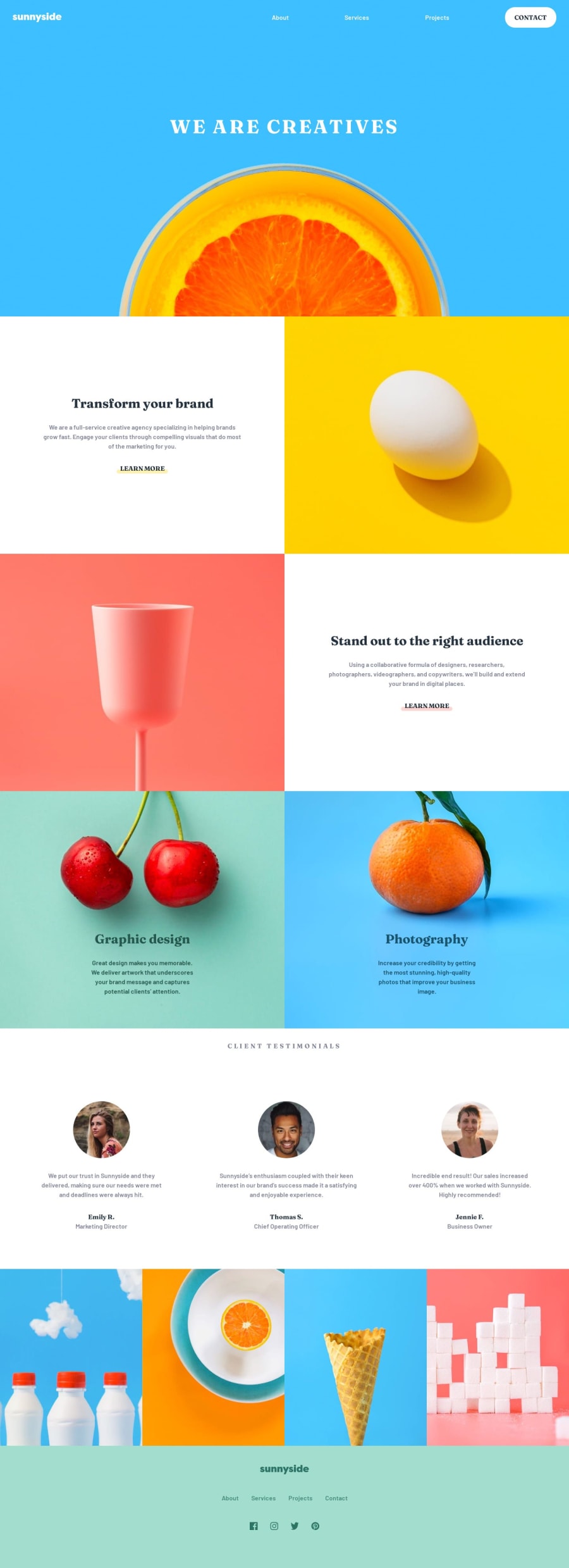
Design comparison
Solution retrospective
Coding the Sunnyside Landing page allowed me to practice various skills as it relates to CSS fundamentals and semantic HTML. I encountered a couple difficulties in this project, including making the hamburger menu, having the nav bar be responsive depending on screen size, as well as smaller issues such as the underline styling. When it comes to the hamburger menu, at first I tried using the "checkbox" hack, however the issue with using that solution is it raises accessibility concerns. I ended up using two elements with classes to identify which was to be used for what screen sizes (mobile vs. desktop) but I don't think that is optimized at all. For the middle images and text containers, I struggled to eliminate white space that would occur if the width was not set for the section. I definitely want to continue practicing creating a one to one copy of what is given because I know that in some aspects there are some deviations in styling. I think this is also affected by the lack of direct access to the Figma file which means that I'm eyeballing a lot of spacing. With more practice this will become easier. My biggest questions are related to responsiveness and making sure a decision is accessible. Something I read up on was aria-labels and I want to incorporate more accessibility features in my future submissions. Any feedback is welcome!
Community feedback
Please log in to post a comment
Log in with GitHubJoin our Discord community
Join thousands of Frontend Mentor community members taking the challenges, sharing resources, helping each other, and chatting about all things front-end!
Join our Discord
