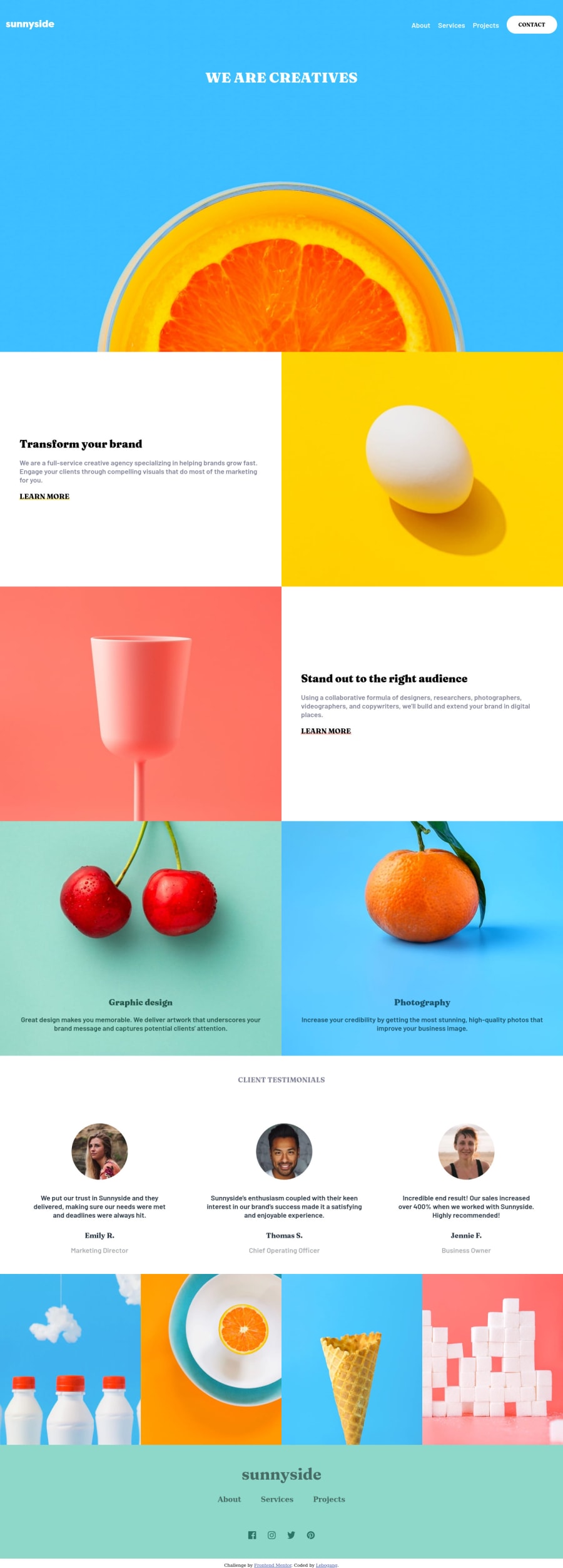
Sunnyside Landing Page - Used SCSS and tiny bit of JS
Design comparison
Solution retrospective
On mobile view I struggled to get the menu (the white background of the menu) to align perfectly with the sunnyside logo and the hamburger menu bars. I would greatly appreciate any help on how to approach this.
Community feedback
- @JeuriMorelPosted over 3 years ago
Try replacing "width: 94%" on the menu with "width: calc(100vw - 30px)". The thirty pixels represents the 15px of padding on either side of the navbar.
Marked as helpful0 - @ChamuMutezvaPosted over 3 years ago
- interactive elements such as buttons and anchor elements should not be replaced by elements such as divs. If you use a div in the place of a button, then use aria values to improve its accessibility. In its current state assistive technology users won't be able to benefit from hamburger menu.
- a button and an anchor element should not be nested, they are both interactive elements.
- use responsive images techniques to display appropriate images across devices (srcset or picture element). The method you used is expensive as each and every image has to be downloaded even though some are not used. Eg by opening the site on mobile, desktop designed for desktop are downloaded at my expense. Responsive images techniques do not permit that
Marked as helpful0@iLebo-stackPosted over 3 years ago@ChamuMutezva this is one solid feedback, as for the images I have to look up what you mean and how to use responsive images techniques to display appropriate images across devices.
0@ChamuMutezvaPosted over 3 years ago@iLebo-stack , see the following article, that might help you get started responsive images
0
Please log in to post a comment
Log in with GitHubJoin our Discord community
Join thousands of Frontend Mentor community members taking the challenges, sharing resources, helping each other, and chatting about all things front-end!
Join our Discord
