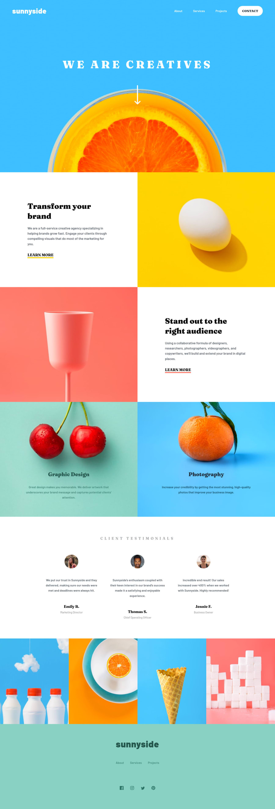
Sunnyside Landing Page Challenge - Stanisalv Tiryoshin
Design comparison
Solution retrospective
My first ever complete landing page from scratch - many questions arose.
How to organize the layout better? I know there is a mess in the header section.
How to properly make the hamburger button? It is not working probably because of the bad layout.
How to simplify implementing resopnsiveness? It was the hardest part for me.
What is the better way of placing the slogan "We are creatives" and the arrow icon to make responsiveness of header section easier to implement?
In the gallery section, should I have used distinct images (cherry and orange) or should I have made them background images? Probably latter as making them responsive was quite a pain.
Should I start by making the mobile version first and then move up to the desktop one?
Is there a mess with units? I tried to use the % for responsive paddings and margins, but used rems for fonts and some margins/paddings. What are the general recommendations on which one to use in which situation?
Thank you in advance!
Community feedback
Please log in to post a comment
Log in with GitHubJoin our Discord community
Join thousands of Frontend Mentor community members taking the challenges, sharing resources, helping each other, and chatting about all things front-end!
Join our Discord
