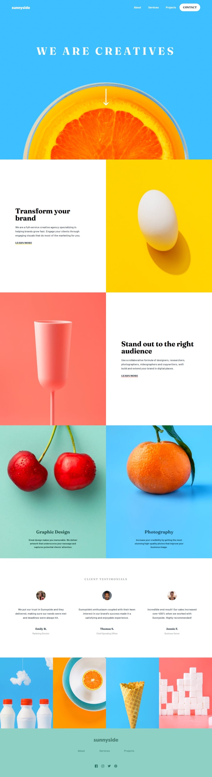
Sunnyside Landing page


Design comparison

Solution retrospective
For this project, I'm most proud of how I structured the components and styled them efficiently using Tailwind CSS. I also enjoyed implementing the hover effect for the underline.
If I were to do things differently next time, I’d focus on optimizing the responsive design even more and ensuring smoother animations for hover effects. I’d also explore alternative ways to handle custom colors in Tailwind without workarounds.
What challenges did you encounter, and how did you overcome them?I struggled with customizing underline styles and offsets in Tailwind. I overcame this by tweaking decoration properties and experimenting with different approaches. Still open to better solutions!
I’d love feedback on improving the underline offset effect so it partially covers the text. Also, any tips on optimizing my Tailwind approach for better maintainability would be appreciated!
Community feedback
Please log in to post a comment
Log in with GitHubJoin our Discord community
Join thousands of Frontend Mentor community members taking the challenges, sharing resources, helping each other, and chatting about all things front-end!
Join our Discord