Design comparison
Solution retrospective
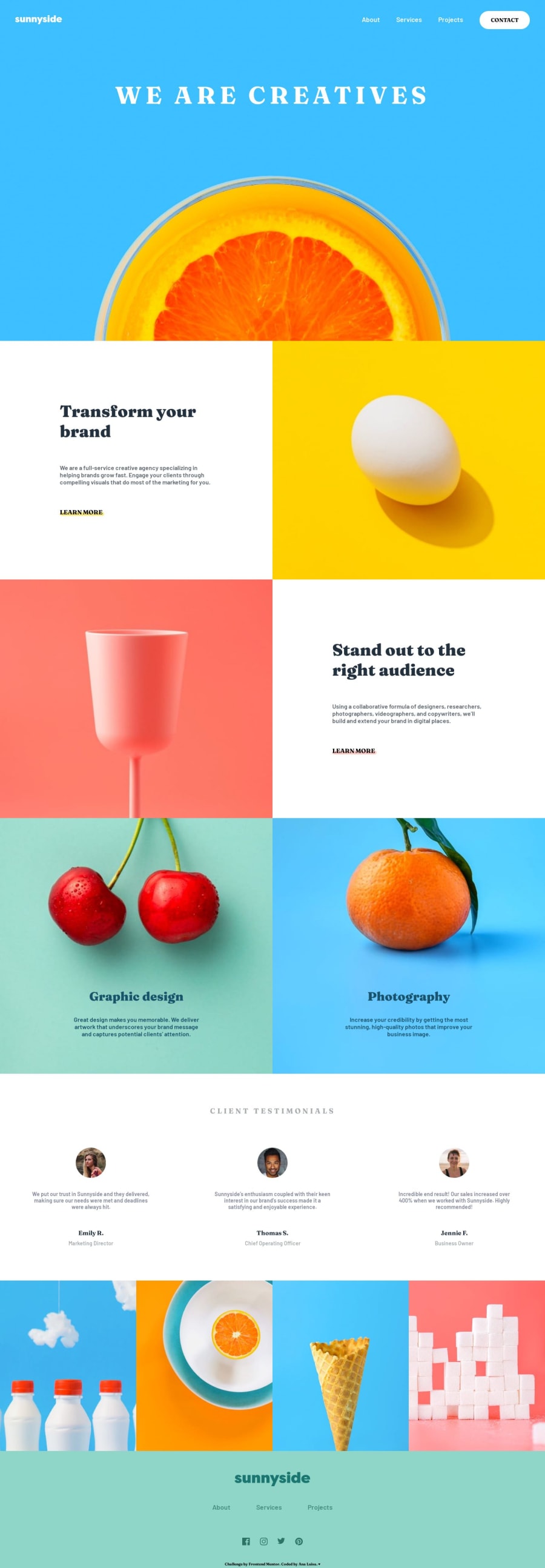
To be honest, I don't know if it's right. I didn't know if each square on the page was supposed to be seen in the full size of the screen (mobile), but when in doubt, I did it that way. I thought it would look better.
Any suggestions are welcome ♥
Please log in to post a comment
Log in with GitHubCommunity feedback
- @PipouwPieuw
You did well, I think it looks good on desktop and mobile!
That being said, there's an horizontal scroll on desktop. The section linha-5-imgs seems to be at fault.
In the footer, I guess social media icons need to be linked to their respective social media page.
Your interactive elements (links and buttons mostly) would look even better if you put hover effects on them, like you did on the Contact button. You may also set a transition so the effect would be more pleasing to the eye :)
Well done overall!
Marked as helpful
Join our Discord community
Join thousands of Frontend Mentor community members taking the challenges, sharing resources, helping each other, and chatting about all things front-end!
Join our Discord
