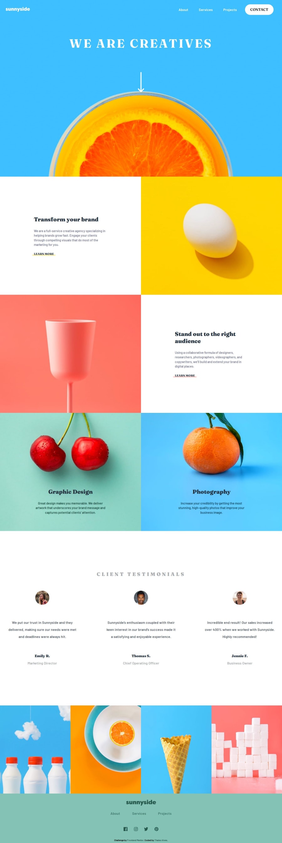
Sunnyside agency landing page with Sass/Scss
Design comparison
Solution retrospective
I am proud that this was my first landing page built on my own, and I am extremely satisfied with the result. What I would do differently next time would probably be trying to use the Mobile First workflow.
What challenges did you encounter, and how did you overcome them?Using Sass, I encountered small specificity issues in certain components when adjusting to various screen sizes. However, it was easy to resolve them by applying the same specificity assigned at the beginning.
What specific areas of your project would you like help with?I would like to receive tips regarding the media queries I used. I felt quite unsure if I was adapting font sizes, divs, etc., in a pleasant way for each screen size. As for the use of Sass, I would like to understand if I used its features correctly and what else could be leveraged from it for a cleaner and more efficient development.
Community feedback
Please log in to post a comment
Log in with GitHubJoin our Discord community
Join thousands of Frontend Mentor community members taking the challenges, sharing resources, helping each other, and chatting about all things front-end!
Join our Discord
