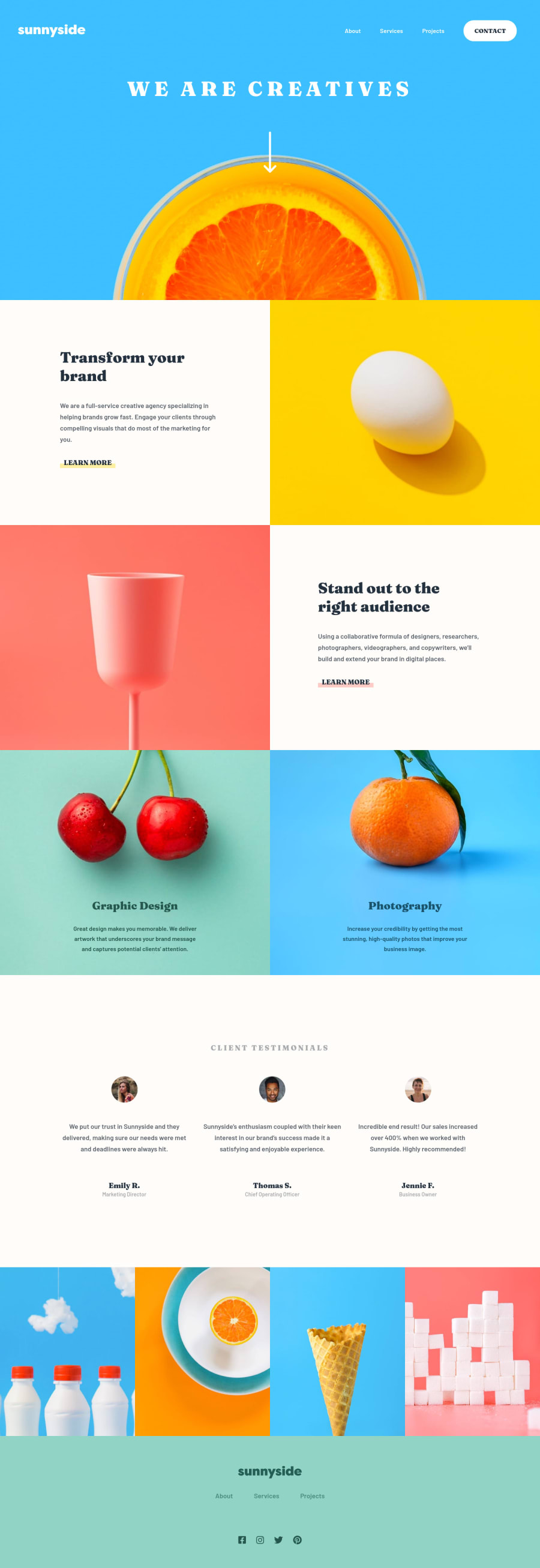
Design comparison
Solution retrospective
So, my main question would be : how to use container by the same way bootstrap do ? I mean, I definided some width
to my page to be as close as the design at possible, but I guess it would be better if my colors continue on right and left, instead of this black background. How can I define a nice wrapper in native HTML/CSS ?
Also, I wanted to animate my toggle burger-menu, but I struggled because of display: block
... any suggestions ?
However, pretty interesting and real-sized exercice ! Liked it, altrough it was a bit long !
Community feedback
- @kens-visualsPosted about 3 years ago
Hey @FlorianJourde ππ»
I have some suggestions for the project.
- I recommend using
ul
andli
for the bothnav
s at the top and bottom, also you could put the social media icons in a list as well. Although they don't look like so, but they are lists and it would be semantically more correct to write them like so. - Next, -for the logo, add
aria-hidden="trueβ
, because it's for decoration. You can read more aboutaria-hidden
here. alt
tags for the user's images should be their names, like this:
<img src="images/image-emily.jpg" alt="Emily R.">
- Lastly, to answer your question about
width
, avoid using fixedwidth
s that's what causing problem here and add those black lines on the both sides on every viewport width. For such big things like layouts, images, etc. the best choice would relative units, such as percentages.
I hope this was helpful π¨π»βπ» other than that, you did a pixel perfect job, well done. Cheers πΎ
Marked as helpful1@FlorianJourdePosted about 3 years ago@kens-visuals Thank you for this helpful comment !
I took a while to resolve everything which wasn't working on my design :
.learn::after
for the underline ;max-width
properties is now replacing bigpaddings
everywhere, which was breaking the design ;- adding some smooth cool effect... thanks to @AM46 for inspiration !
- thanks to you, I also adjusted semantic HTML for
ul
andli
, wrongaria
properties.
If I catch you a bit more time, @ken-visuals, I would like to have your opinion on my main HTML structure : do you think it's a good one ? Is having everything (
nav
,header
,main
) inside awrapper
is right ?Since I resolve challenges on this website, I try to avoid
section
elements, cause I often get HTML issues with it (mostly missingh1
)... Is it really a big problem if my report is not empty ?Thanks again, have a great day !
0@kens-visualsPosted about 3 years ago@FlorianJourde you're welcome, glad to be helpful π
It's absolutely okay because
wrapper/container
are used for design purposes, and as long as you have other part of the website semantically written, it won't matter whether you wrap it or don't.You get those section warning for these reasons. First, when you use a
<section>
you have to have a heading, likeh2-h6
. Next,<section>
is for bigger parts of a layout, such as, contact us about us, image gallery, etc.Reports are just there to help you fix the issues and to educate you about kinds of issues. I'd say it's a good practice to fix them, especially most of the time errors have very descriptive solutions and adding a couple of lines to your code will fix them and help you along the way. However, there are some cases that resolving them is impossible, such as in the last challenge I completed. It says that I have to have at least one heading, but there's nowhere to add a heading, or it says that by default a button shouldn't be disabled, but both the design and functionality make it more logical to have it disabled by default. So in this case I may just leave them like that.
I hope this was helpful π¨π»βπ» Cheers πΎ
Marked as helpful1@FlorianJourdePosted about 3 years ago@kens-visuals Particullary helpful, as always. I'm beginning the next challeng right now, I'll try to be careful about what you said in this message. Thanks again for replying !
0@kens-visualsPosted about 3 years ago@FlorianJourde you're welcome, glad to be helpful π
Marked as helpful0 - I recommend using
Please log in to post a comment
Log in with GitHubJoin our Discord community
Join thousands of Frontend Mentor community members taking the challenges, sharing resources, helping each other, and chatting about all things front-end!
Join our Discord