Submitted 3 months ago
Sunnyside agency landing page using react with scss
#react#sass/scss#bem

P
@raygdev

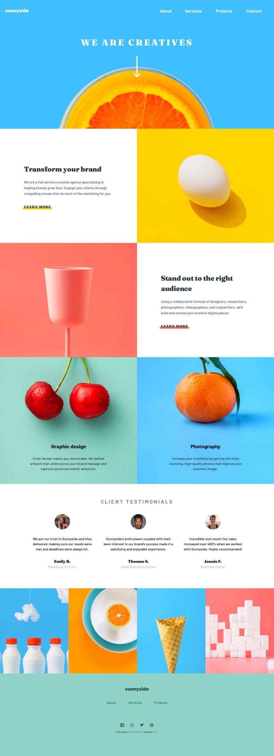
Design comparison
SolutionDesign

Solution retrospective
What are you most proud of, and what would you do differently next time?
I think the design came out ok. I think I would probably choose to do a little more separation in the css for breaking down the components. Also, for something simple like this, stick to vanilla js and html instead of using a framework/library. Also would probably consider using grid for the next one instead of flex.
What challenges did you encounter, and how did you overcome them?I encountered a few challenges.
- Having a layout shift when the links were hovered in the nav bar. It became Challenging when dynamically updating them to uppercase.
- I was taught about using grid to handle this specific situation. By using a grid layout in the links I could use a stacking context with 2 spans and swap out visibility between the two during different states. This helped address accessibility issues and allowed the larger uppercase text to take up the full width even when it wasn't visible effectively removing the layout shift on hover.
- I struggle with the navigation for mobile. Specifically around styling the top right triangle of the container and the placement of it.
- I ended up using a tool called css-generator that was able to get me the desired effect. The code was in css. I found that when copying that over to scss that it didn't work the way I intended. So I chose to have that specific css in a regular css file to keep moving forward.
- For the positioning, I had to use a combination of absolute and relative positioning. I didn't like it, but for me was the only solution I could see. It isn't completely responsive, but gives the desired effect.
- Deciding the hierarchy for the client testimonials cards.
- After some suggestions about using
blockquotes, and diving into a bunch of forums, I ultimately chose to go with a parentfigureelement and ablockquotefor the comment and afigcaptionfor the name and a nested span for the title. I went from forum to forum on how to properly mark this up. The information was too conflicting to come to a truly definitive conclusion.
- After some suggestions about using
I Think there are a few things I need cleared up
- Does the html (jsx) look properly structured for something like this? I had read that it isn't a good idea to directly style a semantic element so I chose not to. But I think it would have been a lot cleaner in jsx had I done it. Is this a true statement or is it preference?
- Is there a better way to make the nav bar positioned without using absolute positioning? Or is this the way to do it? It seems challenging (depending on the relative parent) to obey the padding and margins. I had to do a little bit of calculating and adjusting as the screen grew.
- This is my first time really trying BEM. I do like the idea of it, but I think my naming could use some work. And it was also challenging to figure out how to name other nested elements based on it. I saw a few different styles of BEM, but not sure if I'm using the hyphens and underscores correctly. Any suggestions on that to clean it up would be greatly appreciated.
I'm sure there is more I will likely think of later.
Community feedback
Please log in to post a comment
Log in with GitHubJoin our Discord community
Join thousands of Frontend Mentor community members taking the challenges, sharing resources, helping each other, and chatting about all things front-end!
Join our Discord