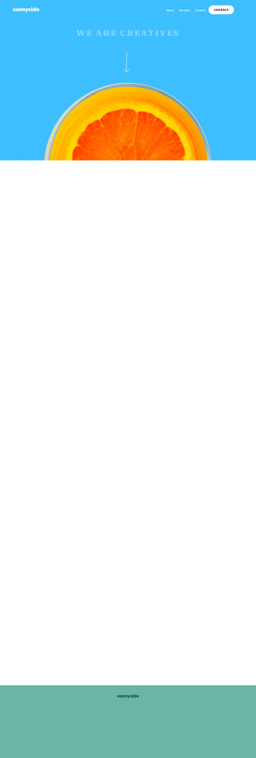
Sunnyside agency landing page using HTML + SCSS + Vanilla Js
Design comparison
Solution retrospective
Hi everyone, any feedback to improve my code is really appreciated 🙏🏼👨🏼💻
Community feedback
- @palgrammingPosted over 3 years ago
Nice touches with the little animations.
Currently the white down arrow is interfering with your mobile menu when it is opened sometime. The arrow is on the layer on top of the mobile menu
also between the Graphic design cherries and the Photography oranges you have a little gap between them
But overall very nice job on this challenge
Marked as helpful1@Jose-Angel-ReyPosted over 3 years ago@palgramming Thank you very much for your feedback, I already solved the issue of the arrow in the mobile menu and other details in the layout of the main content, I hope you like the result. ✌
0 - @YannisHaismannPosted over 3 years ago
Wow i really love how elements appears with animations ! Well done (I will try to do the same when i will do this challenge) :p
Just one advice from my feelings. The elements take a little to much time to appears remove some ms and that's will be like perfect.
Keep working on your code !
Marked as helpful0@Jose-Angel-ReyPosted over 3 years ago@YannisHaismann Thank you very much for your feedback, I already applied the tips about the animation time and solved some errors in the layout, I hope you like the result ✌
0
Please log in to post a comment
Log in with GitHubJoin our Discord community
Join thousands of Frontend Mentor community members taking the challenges, sharing resources, helping each other, and chatting about all things front-end!
Join our Discord
