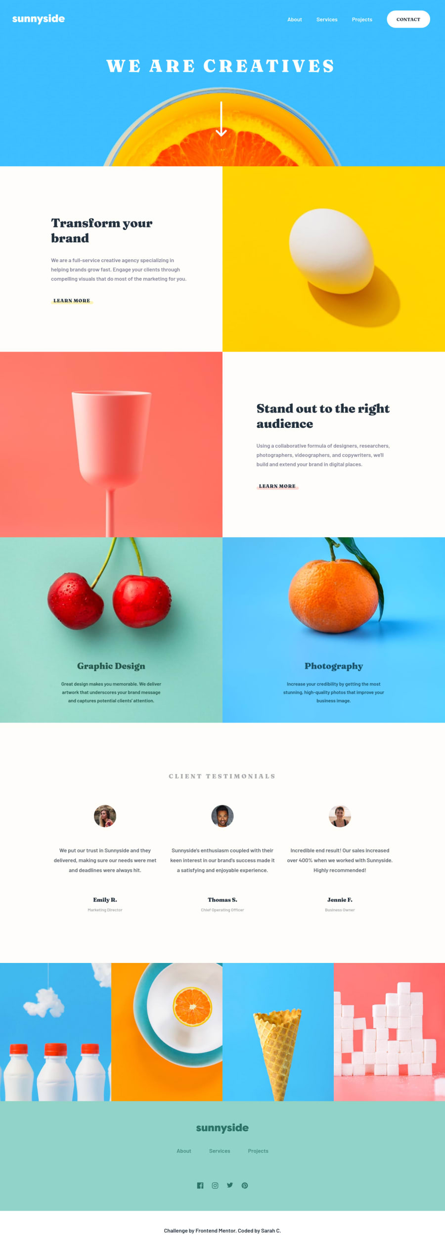
Sunnyside agency landing page - Tailwind CSS, PostCSS, JS
Design comparison
Solution retrospective
Enjoyed this challenge and using Tailwind CSS again - maybe not the best use case for it when the design file has such little consistency between typography and spacing. But that's more a complaint about the design than Tailwind ;)
I liked the layout challenges and trying to make the design look good at every screen size. I can see the improvement in my own knowledge and ability from when I originally started this challenge a while back.
I have tried to focus on making the navigation accessible - if anyone has any feedback on this or anything else, would love to hear it!
Join our Discord community
Join thousands of Frontend Mentor community members taking the challenges, sharing resources, helping each other, and chatting about all things front-end!
Join our Discord
