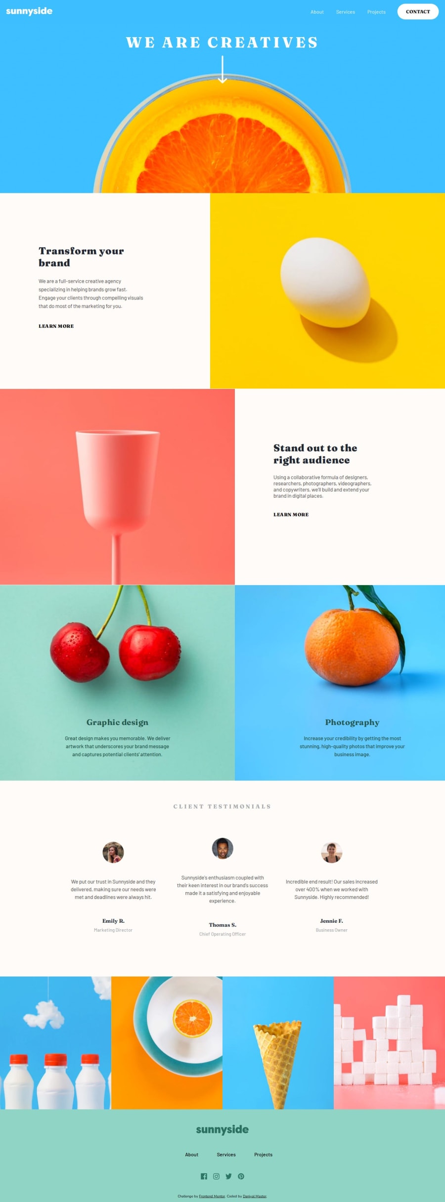
Design comparison
Solution retrospective
I started by creating divs and adding elements within them. I assigned classes to each div and moved onto the CSS. I imported the required fonts, started by removing some default browser styles, and began styling the header. I used my prior knowledge, split up the header into two sides, and used the appropriate flexbox properties to get the design I wanted. Next, I moved onto the title, where I styled the text and spent some time figuring out the design for the image and arrow. Then, I moved onto the sections, where I once again used prior knowledge to get the split layout and the right spacing for the text. Now, I started to design the testimonials section, where I used properties like margin and padding to get the right spacing between the people and quotes. Then, I created the gallery of images and styled the footer, with the social media logos, the company log, and some links. Lastly, I spent some time working on hover effects and added some media queries to start my progress towards learning responsive layouts and web design. Before deploying my website, I checked out how it worked, looked on multiple browsers, and used the built-in device emulation feature to see how it would look on different screen sizes. My next steps would be to work on creating an underline instead of a highlight for the "Learn More" links.
Community feedback
Please log in to post a comment
Log in with GitHubJoin our Discord community
Join thousands of Frontend Mentor community members taking the challenges, sharing resources, helping each other, and chatting about all things front-end!
Join our Discord
