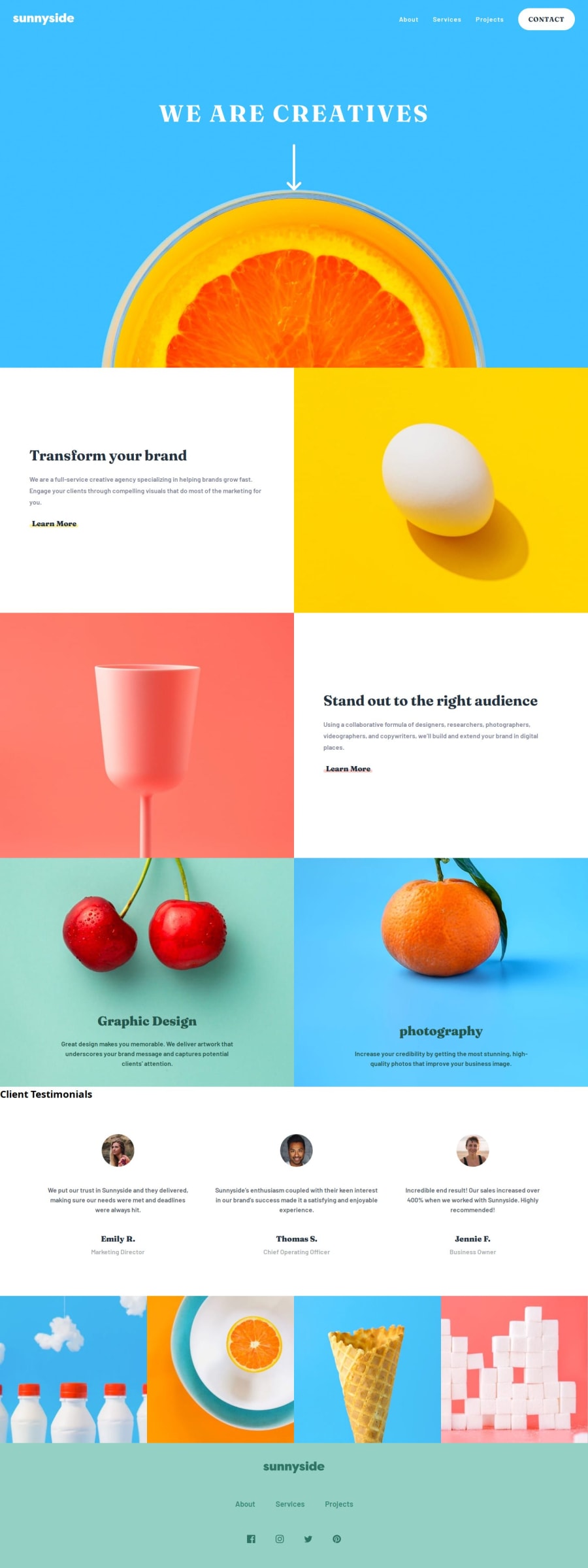
Design comparison
Solution retrospective
In this project, I learned how to effectively implement a mobile-first approach and create a fluid layout that adapts seamlessly across various screen sizes. Here are the key areas I focused on:
Mobile-First Approach:
Designed the layout with mobile users as the primary audience, ensuring a solid foundation for smaller screens. Gradually enhanced the design for larger screens using media queries. Fluid Layout:
Utilized flexible units like percentages and viewport-based dimensions to ensure elements resize gracefully. Applied responsive typography and images to maintain aesthetics and readability across devices. Navbar Toggle:
Implemented a toggle button for the navigation bar to enhance usability on mobile devices.
What specific areas of your project would you like help with?I aim to deepen my understanding and skills in the following areas:
Advanced Responsive Design:
Explore more sophisticated techniques for creating fluid and adaptive layouts. Implement advanced CSS features like clamp(), CSS Grid, and Flexbox for complex designs. JavaScript Logic:
Enhance my proficiency in JavaScript to create more dynamic and interactive user experiences. Develop custom scripts for advanced functionalities like dynamic content loading and state management.
Community feedback
Please log in to post a comment
Log in with GitHubJoin our Discord community
Join thousands of Frontend Mentor community members taking the challenges, sharing resources, helping each other, and chatting about all things front-end!
Join our Discord
