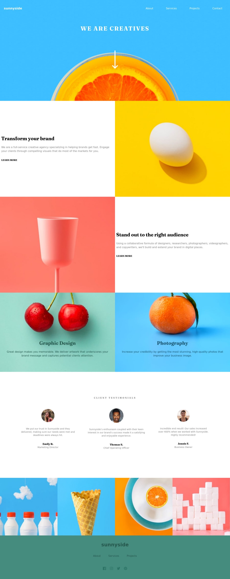
Design comparison
Solution retrospective
Using tailwind i have found a issue or something i dont understand, so i really like tailwind but find out that it is really annoying when trying to change images on a break point. Normally i would have a img tag and use a @media query to change it, however with tail wind i need to use DIV and i have to set is height using vh which is fix throughout one given break point and will not scale lime img tag would.
I have also failed to add the speech like bubble effect on the mobile menu, had no idea how to get started would be great to get some directions so i can try in future.
Community feedback
- @visualdennissPosted over 1 year ago
Hey there,
you have did a great job implementing the design successfully! It looks good overall. I would like to mention that when hovering over menu, the change seems to be a bit abrupt. You maybe find another and smoother way to have an hover effect. Regarding speech bubble effect, i'd suggest checking my solution of this challenge to see a one way of doing that.
Hope this was helpful!
1@tomazi15Posted over 1 year ago@visualdenniss Thank you for taking your time and the feedback much appreciated . Yep i could defo improve the desktop version of the menu. I had a look at your solution and also noticed that there ares some details i did not capture ie: the menu has a smooth underline rather than hover bubble for every menu item did you have access to figma..?. Once again thank you for your time
0@visualdennissPosted over 1 year ago@tomazi15 Happy to hear it was helpful. No i did not have access to figma as i'm not a premium member. But i just looked at the design files given freely in the challenge and decided to go with whatever seemed right to me. Contact button seems to be a CTA, a call to action button, so it is normal that is looks distinctive. Other links are navigation links, so it does not mean that they should have the same design as contact button when hover. So in such cases, i use my own initiative to do the challenge as i see fit and consistent, so i chose to have an underline animation in this case. Another example is that i've added an hover effect to the big arrow on the front page and onClick directs you to other section.
Always feel free to add something on top of the given design! :)
Marked as helpful1 - @cornelldevPosted over 1 year ago
I envy your tailwind skills Tomazi. Could you point me right, I'm trying to add Tailwind to my Arsenal. Not sure if it was a good practice then or now, but I used clip path for that speech bubble part, I simply added this to the css "clip-path: polygon(0 15%, 88% 15%, 100% 5%, 100% 100%, 0 100%).
0
Please log in to post a comment
Log in with GitHubJoin our Discord community
Join thousands of Frontend Mentor community members taking the challenges, sharing resources, helping each other, and chatting about all things front-end!
Join our Discord