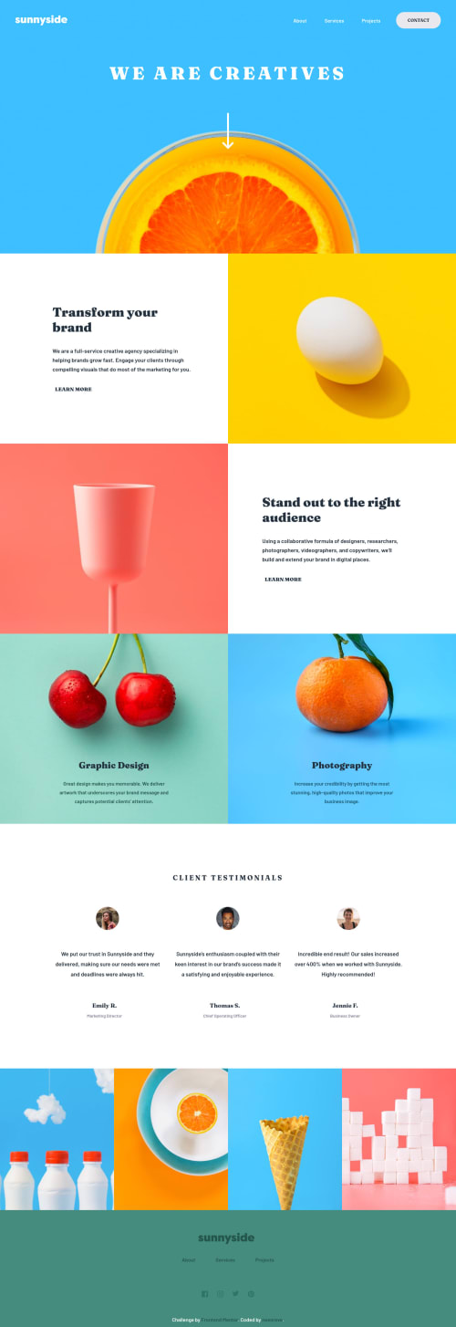
Sunnyside agency landing page

Solution retrospective
Still learning the little quirks to dynamically switching image sources. And surprised how complicated it can get.
HTML with the srcset attribute:
<img class="bg-img" id="landing-bg-img" src="images/mobile/image-header.jpg" srcset="images/mobile/image-header.jpg 888w, images/desktop/image-header.jpg" alt="Background image" />
This is the way to go for accessibly. My gripe here is that you're ending up declaring twice (HTML & CSS) your breakpoints. I'm guessing that in most cases there will be a few different breakpoints but it just seems like most format decisions are made in CSS and that changing the src url should be the standard. Tell me why that's not the case? To further emphasize this, adding complexity like a grid format may lend itself to additional use of the size attribute. When doing that it formally ends up being written just like a media query in CSS.
CSS declaring the src:
<img class="bg-img" id="landing-bg-img" src="" alt="Background image" />
Again already likely a part of your CSS.
` #landing-bg-img { content: url(../images/mobile/image-header.jpg); }
@media (min-width: 888px) { #landing-bg-img { content: url(../images/desktop/image-header.jpg); } }
`
To me just the most common sense approach.
Continued development
I used the term gripe cause this could vary a lot in use cases and further in using the picture element correctly as well.
` <picture class="landing__bg-img"> <source srcset="images/mobile/image-header.jpg"> <source media="(min-width: 888px)" srcset="images/desktop/image-header.jpg"> <img class="bg-img" id="landing-bg-img" src="" alt="Background imgage" /> </picture>
`
For now I'll leave this mess and maybe revisit when I understand this on a deeper level.
Please log in to post a comment
Log in with GitHubCommunity feedback
No feedback yet. Be the first to give feedback on James's solution.
Join our Discord community
Join thousands of Frontend Mentor community members taking the challenges, sharing resources, helping each other, and chatting about all things front-end!
Join our Discord