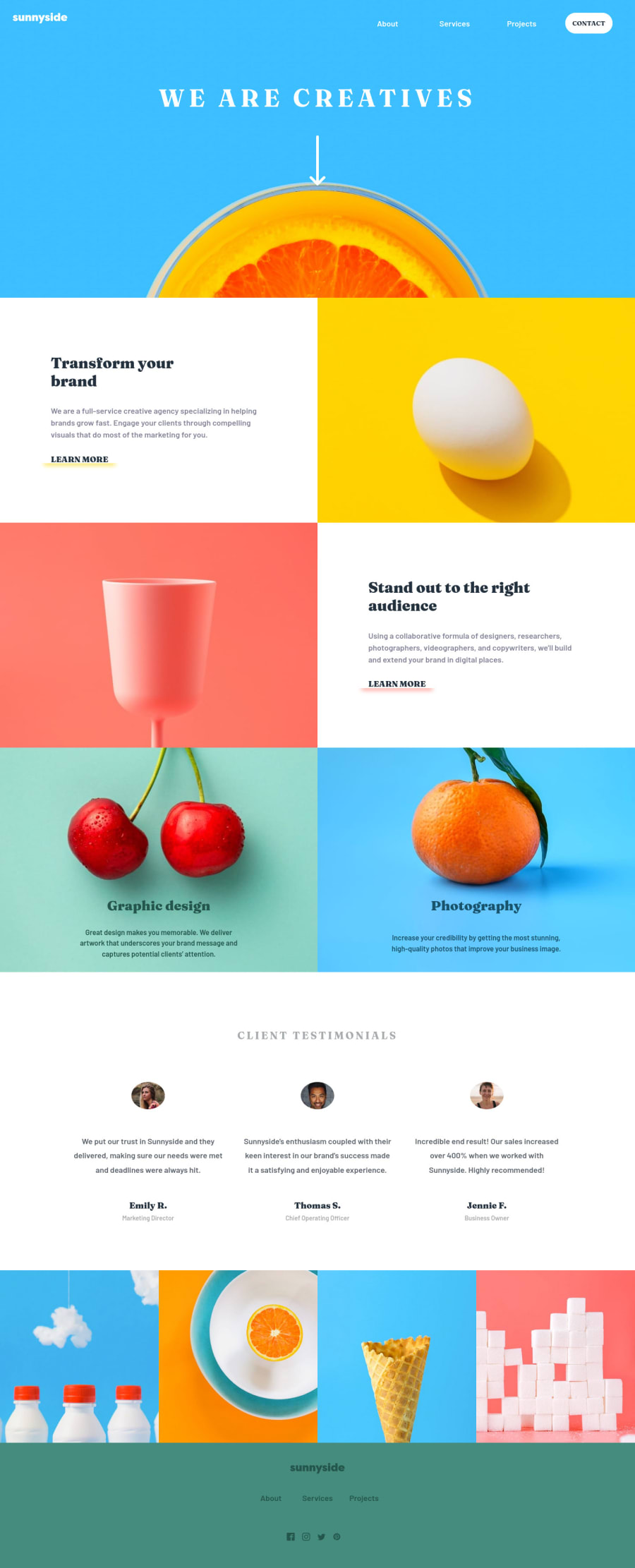
Design comparison
SolutionDesign
Solution retrospective
I have three questions:
- I dont know how to set the menu beak's responsive in all devices.
- To set the responsives images, is it better to set a div with background-image and background-size: cover, or set an img element with srcset of images in different resolutions??
- In the second case, the project only has 2 images resolutions, so the media queries will be mobile and desktop ones, would be better have tablet images resolutions too?
Community feedback
Please log in to post a comment
Log in with GitHubJoin our Discord community
Join thousands of Frontend Mentor community members taking the challenges, sharing resources, helping each other, and chatting about all things front-end!
Join our Discord
