Design comparison
SolutionDesign
Community feedback
- @hernannadottiPosted almost 2 years ago
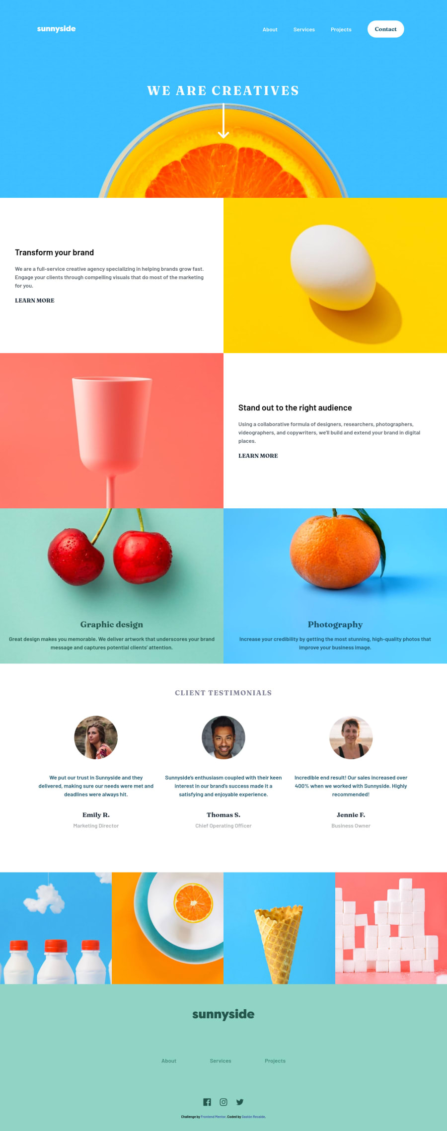
Hi @Gaston-Recalde nice work, just a details, learn more button should have kind of border botton you can achive it using an :after which create a pseudo-element, look at the following code
content: '';
width: 105%;
height: 35%;
background-color: hsl(51, 100%, 49%);
position: absolute;
bottom: 0;
left: 0;
border-radius: .5rem;
opacity: .5;
0
Please log in to post a comment
Log in with GitHubJoin our Discord community
Join thousands of Frontend Mentor community members taking the challenges, sharing resources, helping each other, and chatting about all things front-end!
Join our Discord
