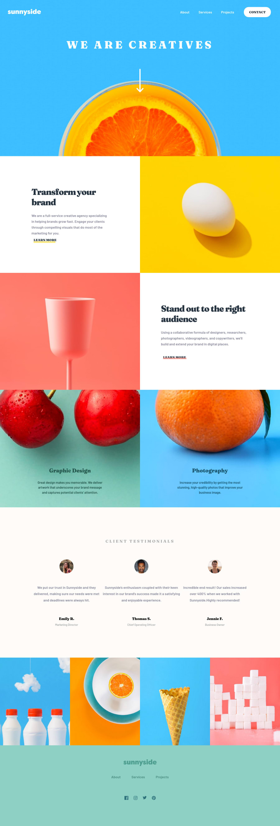
Sunnyside agency landing page
Design comparison
Solution retrospective
Hello, Frontend Mentor community! This is my solution to the Sunnyside agency landing page.
I appreciate all the feedback you left that helped me to improve this project. Due to the fact that I published this project very long ago, I am no longer updating it and changing its status to Public Archive on my Github.
You are free to download or use the code for reference in your projects, but I no longer update it or accept any feedback.
Thank you
Community feedback
- @lilKriTPosted almost 3 years ago
Very cool, looks almost pixel perfect! Do you use the premium files?
0@catherineisonlinePosted almost 2 years ago@lilKriT Thank you, no, I have never used premium. I am using other tools to match the dimensions, like Pixel Perfect and Figma.
0 - @victorkiruiPosted about 3 years ago
Hi @catherineisonline, you did a great job. Nice work, I love how you managed to get it to pixel perfect - that has been something I have been trying to achieve as well.Any tips would be highly appreciated. Thank you :)
0@catherineisonlinePosted almost 3 years ago@victorkirui Thank you! I am using a Chrome extension called Perfect Pixel
2 - @thefolakePosted about 3 years ago
Great job Catherine. Its Excellent Are you on FrontendMentor's slack channel? If yes, whats your name on the slack channel please?
0@catherineisonlinePosted about 3 years ago@thefolake Thanks! No, I am not in the Slack channel
0@yishak621Posted over 2 years ago@catherineisonline the mobile version needs some amendment for the font size and also the images above the footer needs to be grid with 2 column
0 - @ohermans1Posted about 3 years ago
Nice work! You've done a very good job on this one!
0 - @Abdurehman420Posted about 3 years ago
Excellent work!!! keep it up!!!
0 - @kennyoungCPosted about 3 years ago
nice job catherine, looks beautiful and colorful
0 - @JrDevHarshPosted about 3 years ago
Hi @catherineisonline, you did a great job. Your navigation bar menu is working fine for small size device like mobile. But when you open up menu(like single click) and then shift to desktop size device, your menu is not visible.
0@catherineisonlinePosted about 3 years ago@JunDevHarsh I will check it out to fix the issue, thank you!
0 - @newbpydevPosted about 3 years ago
excellent work, I can't wait to get back on the wagon, I decided to do the React course and use these projects to practice, starting next week I will continue with the challenges, keep it up.
0@catherineisonlinePosted about 3 years ago@newbpydev Nice, I am also starting React + portfolio! Good luck!
0 - @dabinderudhanPosted about 3 years ago
Hi @catherineisonline, Amazing work and keep coding... cheers
0 - @PagChomperPosted about 3 years ago
The desktop version is pixel perfect and looks amazing but the mobile version looks a little off. Overall great job
0@catherineisonlinePosted about 3 years ago@PagChomper I will take a look at mobile version again, thank you
0 - @SamadeenPosted about 3 years ago
Hey!! Cheers 🥂 on completing this challenge.. . The fact this is pixel perfect is quite amazing.. Kindly walk me through how you attain this. . You did amazing.. Happy coding!!!
0@catherineisonlinePosted about 3 years ago@Samadeen Thank you. I am using Figma and Chrome extension Perfect Pixel
5
Please log in to post a comment
Log in with GitHubJoin our Discord community
Join thousands of Frontend Mentor community members taking the challenges, sharing resources, helping each other, and chatting about all things front-end!
Join our Discord
