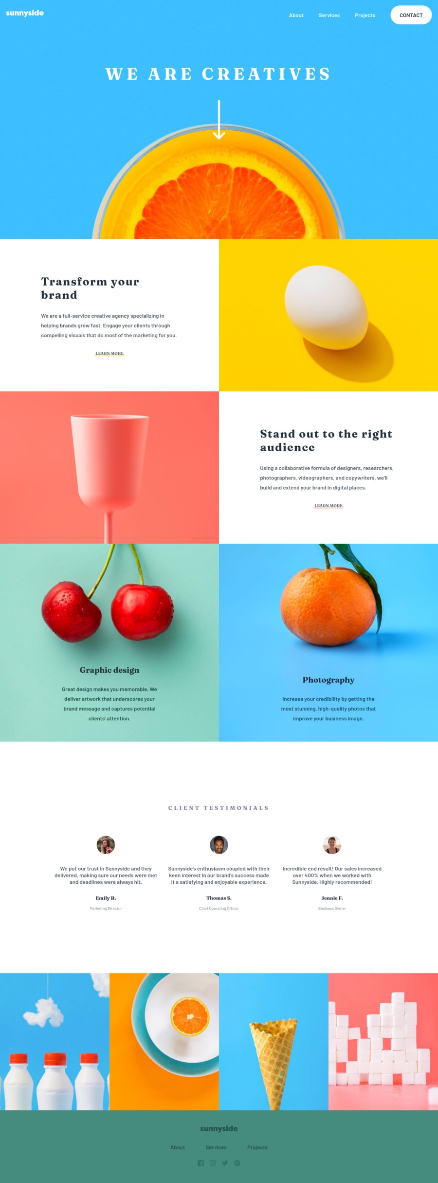
Design comparison
SolutionDesign
Solution retrospective
Help me improve by leaving feedback
Community feedback
- @ChamuMutezvaPosted almost 3 years ago
Hi Lucas
You did well with the challenge, here are a few things that you can look at:
- the site generally good but the header navigation needs attention between 421px and 650px. Try also to center align the logo and the navigation as from 634px
- add some padding on the
wrapper-textcontent so that the content does not touch the edges, i also think that your breakpoints are too early causing the elements to be jammed together. Check the illustration images at about 428px - heavily nested css
.header .menu-show ul li a, can make debugging difficult. Putting classes on thoseaelements is another option to use.
Marked as helpful1 - @lucasfernandodevPosted almost 3 years ago
Thank you very much for the feedback, I will try to improve the code.
0
Please log in to post a comment
Log in with GitHubJoin our Discord community
Join thousands of Frontend Mentor community members taking the challenges, sharing resources, helping each other, and chatting about all things front-end!
Join our Discord
