Design comparison
Solution retrospective
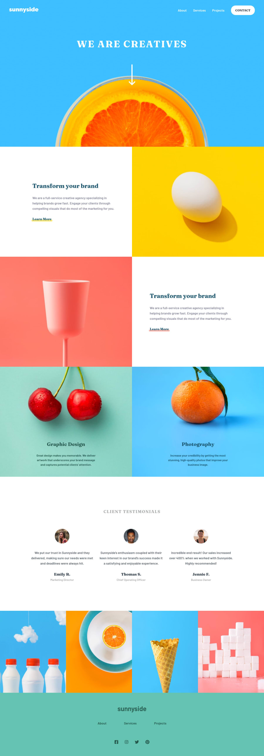
This was a blast to build. How does my CSS organization look? Is my use of media queries good?
Community feedback
- @Yashs05Posted over 3 years ago
You have done tremendous job here in making this page. But it's a suggestion to either remove the fixed position from navbar or apply a background color to it to make it distinctive from other elements while scrolling over them. Hope my suggestion is appreciated. All the best for upcoming projects!
1 - @swapfMPosted over 3 years ago
Remove fixed position from navbar. I think u have written 'transform your brand ' part two times xD. Rest is fine. Good work !!
1 - @davidrhynePosted over 3 years ago
Hi Kyle,
It looks like you have a really good start with the project, so congratulations on the good start. The pages look really good at the mobile and desktop resolutions, pretty much pixel perfect, but I was noticing some word wrapping issues around the 800 and the 1000 pixel range in the client testimonial area.
Instead of using code breaks <br>, please consider using margin and padding on those containers so that they naturally resize themselves as the screen width changes. The data within the container will just break into new lines as necessary.
If it helps, I like to put a border around the various containers to see how they are sizing and interacting with the other containers.
Happy Coding! David
1
Please log in to post a comment
Log in with GitHubJoin our Discord community
Join thousands of Frontend Mentor community members taking the challenges, sharing resources, helping each other, and chatting about all things front-end!
Join our Discord
