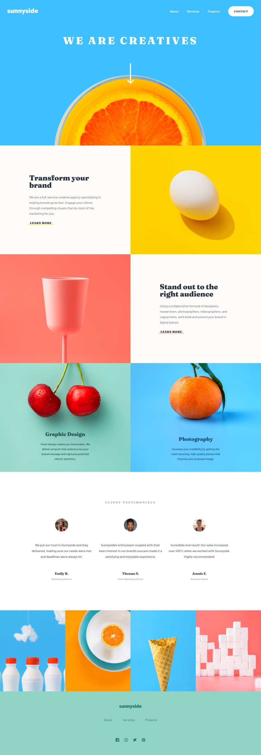
Sunnyside Agency - CSS Grid/Flex - Responsiveness Prioritised
Design comparison
Solution retrospective
Howdy!
Another project I plan to do a video for. I mostly wanted to do this project to understand images, how their heights work, how their 'inbuilt ratios' automatically update their heights as the viewport expands horizontally.
I also wanted to see how this plays into a grid solution and practiced a bit with grid-template-rows: min-content /// auto /// max-content. In the end it was a worthwhile project. I'll spend a bit more time polishing my understanding of my own solution - as weird as that sounds - and will attempt to record a useful video or two to use in replies for anyone who might be struggling with the concepts I explored.
Cheerio 😁
Community feedback
Please log in to post a comment
Log in with GitHubJoin our Discord community
Join thousands of Frontend Mentor community members taking the challenges, sharing resources, helping each other, and chatting about all things front-end!
Join our Discord
