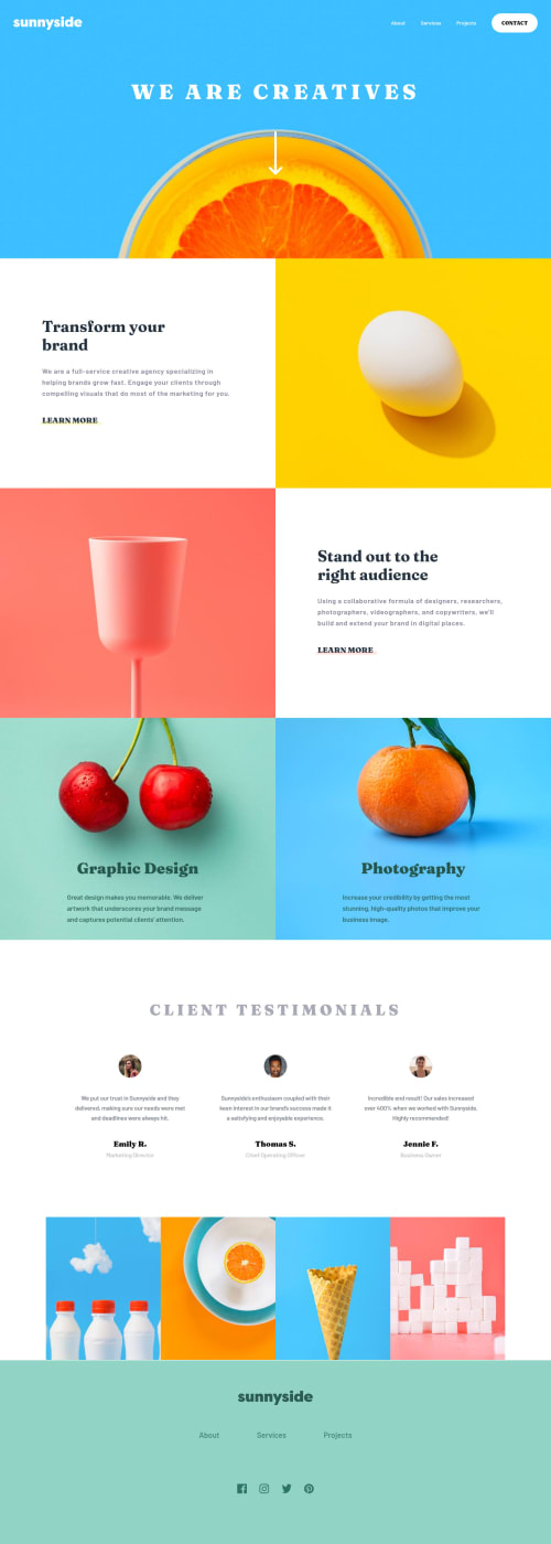
Design comparison
Solution retrospective
Please let me know If you find any issues I would be appreciated it. Meanwhile, I've been coping with the last image section, I could not fit to screen 100% width, If you have a solution for it please let me know.
Community feedback
- @alQaisiPosted over 2 years ago
Hi Suatcan :)
If you want to make it better try to add an aria-label for repetitive semantic elements to make the browser distinguish them, in your solution you have used more than one nav element.
It's not a good practice to put a div inside a button, if you want the div to be clickable just add an event listener to it but it should not be inside a button.
Don't forget to add a heading into any section to fix HTML & Accessibility issues.
By the way, you did a great job!
Marked as helpful0@suatcgPosted over 2 years ago@alQaisi Hi Ahmad, I agree with the repetitive nav element that could have to contain an aria-label in order to make differences between each other.
I forgot to change the div element to the span element which would have been perfect for this problem.
The last problem could have been solved the way that you said, however, I wanted to use the article element due to write correct semantic purposes. As if I wrote just only the heading and paragraph element that could be not correct in this case , for that reason, the heading element that resides in the article element. Please let me know what could have been true for this state. I'm a little confused, Do you have any idea to solve within article element inside the section element?
Thank you for your kindly support, I'm appreciated it.
Sincerely.
0
Please log in to post a comment
Log in with GitHubJoin our Discord community
Join thousands of Frontend Mentor community members taking the challenges, sharing resources, helping each other, and chatting about all things front-end!
Join our Discord