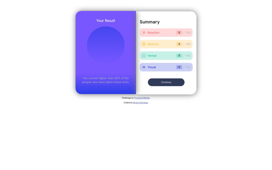
Design comparison
SolutionDesign
Community feedback
- @0xabdulkhaliqPosted over 1 year ago
Hello there 👋. Congratulations on successfully completing the challenge! 🎉
- I have other recommendations regarding your code that I believe will be of great interest to you.
HTML 🏷️:
- Your solution generates accessibility error reports due to
non-semanticmarkup
- So wrap the whole content with semantic element
<main>and change<div class="attribution">with element<footer>to improve accessibility and organization of your page.
- Use HTML5 semantic elements such as
<header>,<nav>,<main>,<aside>, and<footer>to define these sections
CSS 🎨:
- To center the component in the page, you should use
FlexboxorGridlayout. You can read more about centering in CSS here 📙.
body {
    min-height: 100vh;
    display: grid;
    place-content: center;

    margin: 0;
}
I hope you find it helpful ! 😄 Above all, the solution you submitted is great!
Happy coding!
Marked as helpful0
Please log in to post a comment
Log in with GitHubJoin our Discord community
Join thousands of Frontend Mentor community members taking the challenges, sharing resources, helping each other, and chatting about all things front-end!
Join our Discord
