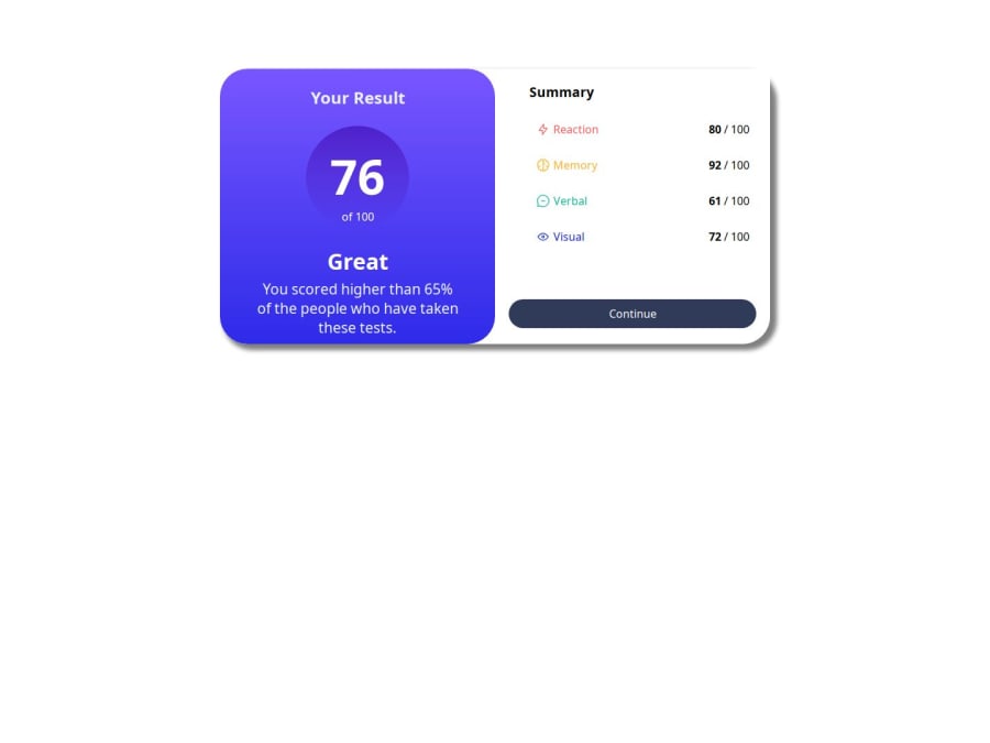
Design comparison
SolutionDesign
Community feedback
- @ArthurAraujo209Posted about 1 month ago
Translate into English: Olá, agradeço a sua ajuda, a parte do .cartao eu acabei esquecendo de remover, mas eu já agradeço a ajuda!
0 - @AdrianoEscarabotePosted about 1 month ago
Hi ArthurAraujo209, how are you doing? I really loved the outcome of your project, but I have a few suggestions that I think might be helpful:
I noticed that your component is not centralized to solve this problem we can do the following:
body {
    display: flex;
    align-items: center;
    justify-content: center;
    min-height: 100vh;
}
and remove:
.cartao {
    background-color: rgb(255, 255, 255);
    width: 800px;
    height: 400px;
    /* margin-left: auto; */
    /* margin-right: auto; */
    /* margin-top: 100px; */
    /* margin-bottom: auto; */
    display: flex;
    border-radius: 40px;
    box-shadow: 7px 6px 6px 3px grey;
}
The rest is excellent.
I hope you find it useful. 👍
0
Please log in to post a comment
Log in with GitHubJoin our Discord community
Join thousands of Frontend Mentor community members taking the challenges, sharing resources, helping each other, and chatting about all things front-end!
Join our Discord
