

Design comparison

Solution retrospective
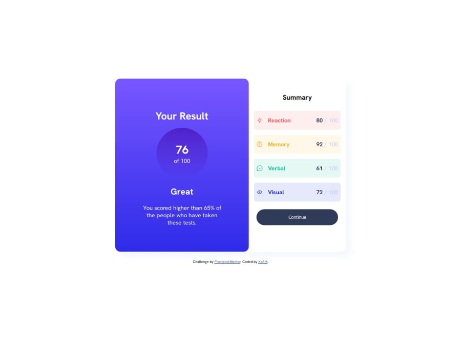
I was able to switch the main card from horizontal to vertical mode using CSS and being able to wrap a div element to the Summary title,making it effectively left-aligned.
What challenges did you encounter, and how did you overcome them?Being able to switch from horizontal to vertical mode was a bit challenging but it was cool. The true challenge was using JavaScript to populate the webpage. I'll hopefully do it soon.
What specific areas of your project would you like help with?Any feedback on code and layout would be helpful. Thank you 🙏
Community feedback
- @dylan-dot-cPosted 4 months ago
Well done on this challenge! It looks good
A few things you can do to make it better would be
- Use more semantic HTML elements like sections, article, main. You should also make the h2 the first heading fo your website so no h3 should be before the h1. If you want it bold use strong or b tag. Also use p or span tags as well.
- Responsiveness is good but you could try a mobile first approach next time to help make it easier to work with.
For js once you get the data whether from fetching or turning it into a js file and importing it... You can setup an HTML template tag with the base structure of the results like image title and value/100.
Then use JS to get that template and loop over your data and fill each template with its correct class name and data then append it the the container element. This is easier than using innerhtml and having the HTML code in a js string which won't let the code look elegant.
Anyways take care!
Marked as helpful1@Kofi100Posted 4 months ago@dylan-dot-c Thanks for the tips. I think I could use the mobile first approach for finishing projects faster and also I will try using more semantic elements on other projects,not to mention changing the h3 tag to h2 too. Also,thanks for the tips on using JavaScript for populating the content of the webpage. I'll try to apply them soon.🙏 Thanks so much and take care of yourself too.🙏✨
0 - @workdotnishaPosted 4 months ago
This is a fantastic project! Adding subtle shadows to elements like .card or .card__box2 can create depth and make the design more dynamic. Try something like box-shadow: 0 10px 15px rgba(0, 0, 0, 0.2) for a polished and professional touch. Keep up the great work!
Marked as helpful1@Kofi100Posted 4 months ago@workdotnisha Thanks so much for the tips.I really needed them. You just made me realize that the cards needed shadows.Also thanks for the encouragement 🙏✨
1 - @Kofi100Posted 3 months ago
Little thing guys,I've updated the webpage now. What do you think please?
0


Please log in to post a comment
Log in with GitHubJoin our Discord community
Join thousands of Frontend Mentor community members taking the challenges, sharing resources, helping each other, and chatting about all things front-end!
Join our Discord