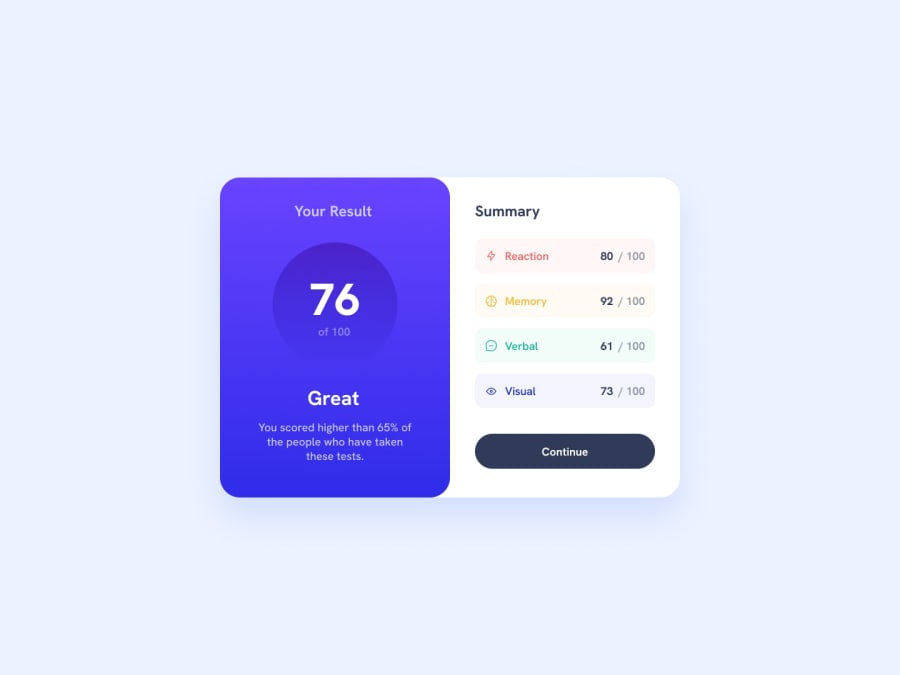
Summary component with flexbox and root variables
Design comparison
Solution retrospective
Hello FE community,
It's been a while since I uploaded my last solution to FE. I started this project today to refresh the knowledge I gained from previous solved projects.
I didn't have any major problems, but I notice that I still lack some knowledge in CSS optimization, which I will probably get by solving the other projects.
What do you think of the current solution to the problem?
Community feedback
- @TodaymorePosted over 1 year ago
Yeah bro cool, I like the way you write code, can you help me with one thing, how you judge that an element should be that size, is there any special app for that, Because you measurement of element is so accurate .
0@francimelinkPosted over 1 year ago@Todaymore
Hi, design this projects become easier for me when I started using Figma.
In Figma you can check sizing, padding, margin etc.
Before that I was trying design by feeling. Sometimes It was good, but sometimes wasn't even close. With Figma It is much easier.
0@TodaymorePosted over 1 year ago@francimelink Okay, Thank you so much Bro. By they way, there is fun when we design by feeling and it look alike the given web page, and when it doesn't, we cursed our programming skills and begin self doubt.
0@francimelinkPosted over 1 year ago@Todaymore
Yes. It is fun😀 I was also solving problem this way until I decided to use Figma.
I think that lot of time we will be using such a tool for implementing designs. And it is good to know how to use it. Also now I am still trying to design by filling, but I can check now how wrong am I.
0
Please log in to post a comment
Log in with GitHubJoin our Discord community
Join thousands of Frontend Mentor community members taking the challenges, sharing resources, helping each other, and chatting about all things front-end!
Join our Discord