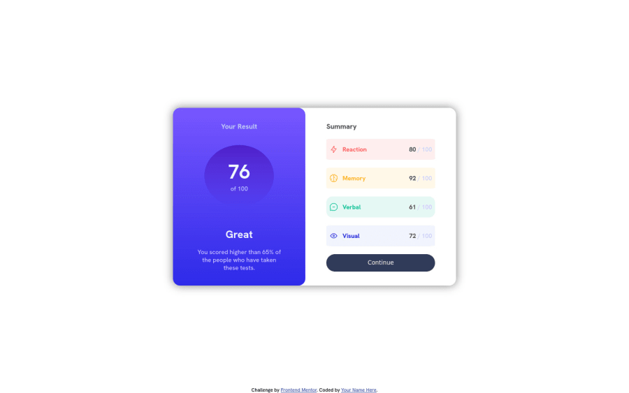
Design comparison
Solution retrospective
Is my code understandable?
Did I use the semantic HTML tags correctly, should I add more or less?
In what areas of my code can I improve on?
All feedback is greatly appreciate. It helps me to improve as a frontend developer. Thanks!
Community feedback
- @KarenMascarenhasLourencoPosted almost 2 years ago
Thank you so much for your help!
0 - @ciaower17Posted almost 2 years ago
The website looks good but its not responsive and it looks bad on mobile, some things that i could recommend are: give the main section a max-width of 45% not only width of 45% as it shrinks when you make the screen width smaller and you could've gave the right section a max-width too so it wouldn't shrink. To make it responsive on mobile you could change the flex direction of the main section to column with the @media funcion and make the main width 100% so it looks as it should. In the field of design i would just say make it a lil bit higher and change the shade and make it be only on under and on the right. The rest looks good, Nice job!
0
Please log in to post a comment
Log in with GitHubJoin our Discord community
Join thousands of Frontend Mentor community members taking the challenges, sharing resources, helping each other, and chatting about all things front-end!
Join our Discord
