Design comparison
SolutionDesign
Solution retrospective
I would like to know your comments that help me to improve my skills
Community feedback
- @CaioCoutoPosted over 1 year ago
Hello, there!
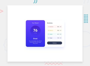
Good job! I noticed 03 things that you may want to give some attention:
- The width of your main element, like the other commenter said.
- The font seems to be a little off, maybe you could try adding the specified font from Google Fonts and importing it into your project with a
<link/>element into the HTML'sheador with a@importin CSS. - In you CSS, you could try grouping all properties a certain element is going to get into a single (there's a
pelement with two blocks of code for it). - Also, check out the font-weight property. It controls the thickness of your font.
0 - @Sana-web-worldPosted over 1 year ago
It's really amazing but I think you should focus on width of card, cause if you compare your purple box and white box both are too big, hope this will help 😊
0
Please log in to post a comment
Log in with GitHubJoin our Discord community
Join thousands of Frontend Mentor community members taking the challenges, sharing resources, helping each other, and chatting about all things front-end!
Join our Discord
