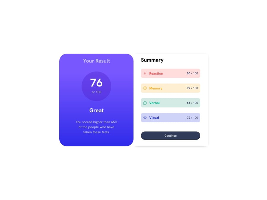
Design comparison
SolutionDesign
Community feedback
- @halivertPosted almost 2 years ago
Hey @Notyan21 this is a great solution to the challenge, I just want to make some suggestions here:
- Using of dynamic viewport units
- You can add a color to box-shadow after the last dimension, to make it look transparent, e.g.:
box-shadow: 2px 2px 14px -10px rgba(0, 0, 0, 0.2);Also I want to congratulate you for the following points:
- Great use of CSS properties
- Nice class naming (good BEM practices)
Keep up with the good job 🎉
0
Please log in to post a comment
Log in with GitHubJoin our Discord community
Join thousands of Frontend Mentor community members taking the challenges, sharing resources, helping each other, and chatting about all things front-end!
Join our Discord
