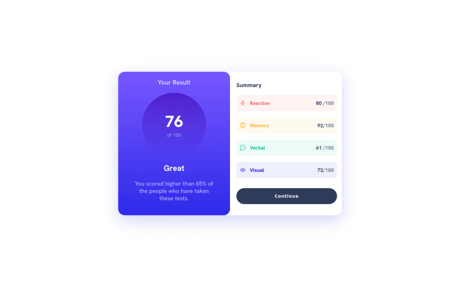
Summary Card Component with Peek-and-Slide Animation - ReactJS
Design comparison
Solution retrospective
Any feedbacks will be appreciated :)
Community feedback
- @Finney06Posted over 1 year ago
Hello there 👋. Good job on completing the challenge !
Here are some suggestions regarding your code that may be of interest to you.
HTML 🏷️:
To clear the Accessibility report:
- Starting with
<h1>and working your way down the heading levels (<h2>,<h3>, etc.) helps ensure that your document has a clear and consistent hierarchy.
I hope you find it helpful!😏 Above all, the solution you submitted is 👌. 🎉Happy coding!
Marked as helpful0@hatemhenchirPosted over 1 year ago@Finney06 Thank you for your feedback on my solution! I appreciate your suggestion to start with an H1 heading and work my way down to lower-level headings to ensure a clear and consistent hierarchy of headings. However, in this particular challenge, we did not have a specific title or important heading to begin with, which is why I chose to start with an H2 heading instead.
I completely agree with you that it's important to establish a logical hierarchy of headings throughout the document and to use headings that accurately represent the content that follows. Thank you for highlighting this point, and I will certainly keep this in mind for future HTML projects.
Thank you again for taking the time to review my solution and for your encouragement. I wish you all the best with your coding projects!
0 - Starting with
Please log in to post a comment
Log in with GitHubJoin our Discord community
Join thousands of Frontend Mentor community members taking the challenges, sharing resources, helping each other, and chatting about all things front-end!
Join our Discord
