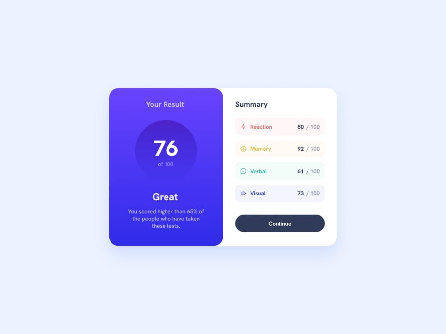
Design comparison
Community feedback
- @JepennnPosted 8 months ago
Nice layout and a functioning application. Had some hard time to understand all of the code... a recomendation is to use comments sometimes in your code to clarify what the codes is doing.
Does the layout look good on a range of screen sizes? Yes the layout looks good on multiple screens
Is the code well-structured, readable, and reusable? It's possible to improve, you can resuse code for your sense boxes for an example. Your card in the UL can be built as an component with props instead.
Does the solution differ considerably from the design? No the product looks a lot like the solution.
0
Please log in to post a comment
Log in with GitHubJoin our Discord community
Join thousands of Frontend Mentor community members taking the challenges, sharing resources, helping each other, and chatting about all things front-end!
Join our Discord
