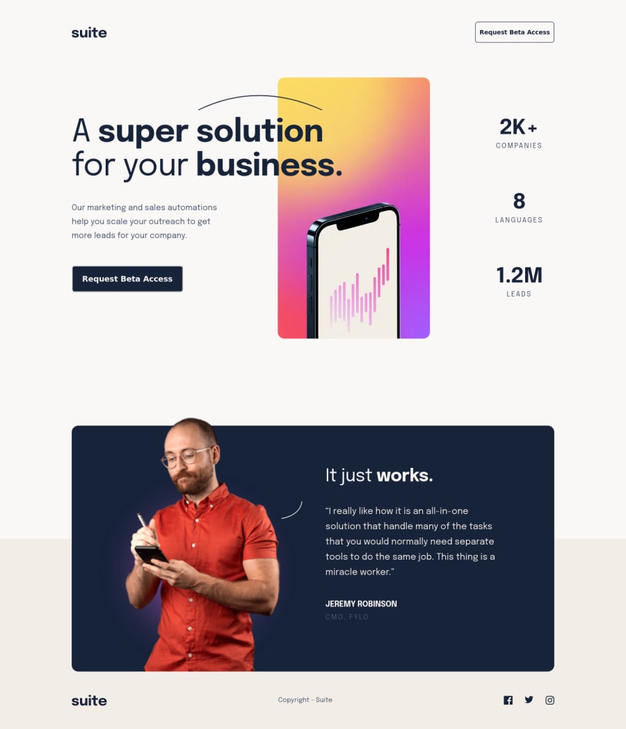
Design comparison
Solution retrospective
Hi all; The overlays were a challenge for me. Sorry, but I think my code is ugly and inconsistent in approach. Hope to revisit and lock this down with some helpful hints.
I still feel I'm not building good responsiveness as using px lots and fixing in widths and heights. Likely need a refresher on responsive coding. I worry I'm building for the solution rather than the overall responsiveness, somewhat regardless of the device.
I did run testing using BrowserStack and appears my solution breaks on some non iOS devices (and <375px) but not convinced the site is working good. My solution worked well on devices I have access too.
Great challenge for me as lots of elements to force you to stay organized.
Thanks all!!
Community feedback
Please log in to post a comment
Log in with GitHubJoin our Discord community
Join thousands of Frontend Mentor community members taking the challenges, sharing resources, helping each other, and chatting about all things front-end!
Join our Discord
