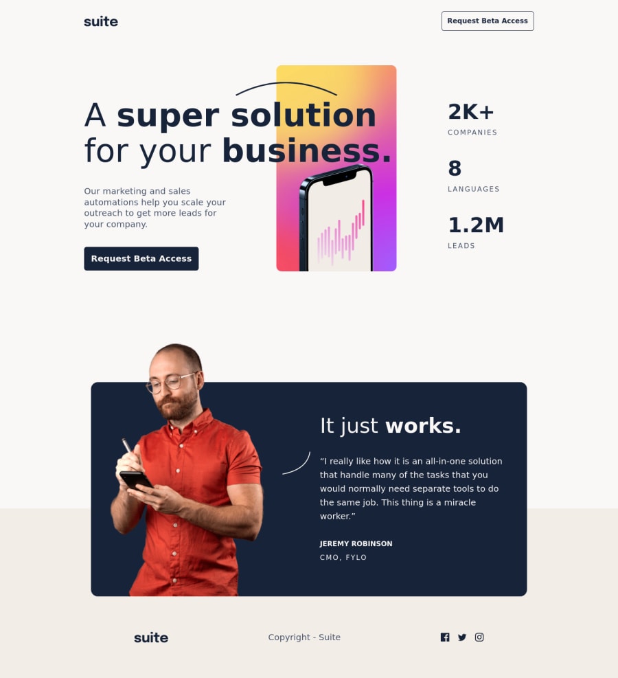
Design comparison
Solution retrospective
Tried out a new methodology for this, CUBE CSS (there's a good walkthrough of the rationale and a sample web page here). Really really liked this, it's quite utility focused but you don't end up with having to remember 1,000 utilities and make your HTML look incomprehensible like you do with Tailwind (but maybe I'm just using Tailwind wrong!). I feel like my CSS is less repetitive and I feel like I wrote less of it than usual (although that might be due to the relative lack of complexity in the project, and would be difficult to measure given the amt of auto generated classes in the config).
Still going to take a bit of getting used to but I think I'm going to bring this more into my CSS more generally (it works really nicely with SASS).
Towards the end I think I got a bit hacky and there's probably a better way I could have done the layout for Desktop than making the hero image and the stats list position: absolute... Any ideas here?
Community feedback
- @ccreusatPosted almost 3 years ago
Hi! Nice job. Your layout is perfect! Wasn't quite satisfied with mine and seeing you, blew my mind ^^
Just something you forgot : the blur pattern behind jeremy's image! :)
Marked as helpful1@fraserwatPosted almost 3 years ago@ccreusat thanks!! And yes, you're right - good spot!
1 - @mnizhadali-afgPosted almost 3 years ago
Hey mate, Nice job and keep it up.
Tip: Always remember to use the generic elements inside the Semantic elements. The HTML Semantics are always for wrapping the HTML elements and giving meaning to them.
Good luck :)
Marked as helpful0 - @vandermsPosted almost 3 years ago
Nice job! Love it!
I cannot see a better alternative to the hero image than
position: absolutesince the text column is above it. Probably, using negative margin was possible, but I think it would be harder to implement and too hackish.About the stats list, in my solution, I put the text group (title, subtitle and call to action) and the stats list in a flex container with space-between. Then, on tablet and mobile design, I set the flex-direction to column. It made my life a little easier. Anyway, it is an alternative.
0
Please log in to post a comment
Log in with GitHubJoin our Discord community
Join thousands of Frontend Mentor community members taking the challenges, sharing resources, helping each other, and chatting about all things front-end!
Join our Discord
