Submitted 6 months ago
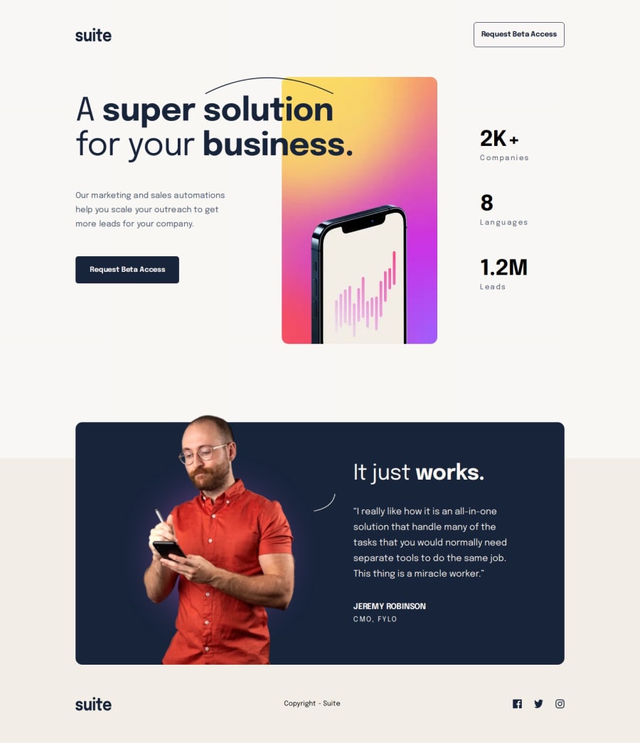
Suite landing page solution with scss/BEM
#sass/scss#vite#bem
P
@vstm
Design comparison
SolutionDesign
Solution retrospective
What are you most proud of, and what would you do differently next time?
Things I am proud of:
- Used
linear-gradientfor the first time, and it didn't blow up in my face :D - Used neovim instead of vscode (which only partially blew up in my face)
Things I could do better:
- In the readme there was a note about thinking first how to structure the CSS, which was a good idea, but I only read about it after I completed the challenge :D.
- I wasn't sure how to handle the blur image, the Figma wasn't helpful as it only showed the dimensions of the circle without the blur around it. Here I just played around with the numbers until it looked somewhat ok.
- I used the responsive images (
and) but I wasn't sure how to test them properly (for example how to simulate that webp is not supported, or the 2x image for apple devices). Is there any easy way to do this in chrome devtools? Or do I need something like browserstack to do that.
Please log in to post a comment
Log in with GitHubCommunity feedback
No feedback yet. Be the first to give feedback on Stefan Vetsch's solution.
Join our Discord community
Join thousands of Frontend Mentor community members taking the challenges, sharing resources, helping each other, and chatting about all things front-end!
Join our Discord
