Submitted over 1 year ago
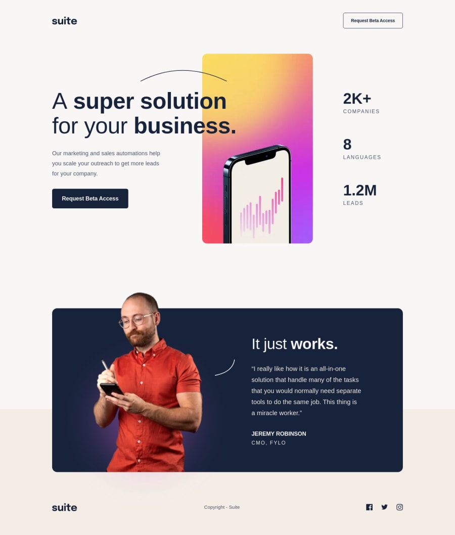
Suite landing page solution
#bem#smacss#sass/scss
P
@Dantalian5
Design comparison
SolutionDesign
Solution retrospective
Hello everyone, this project took me some time, but in the end the result seemed very good.
Easy:
- the beggining!
- create the mobile layout
- the main structure and the specific classes
Difficult:
- start creating a fluid layout for tablets and desktops
- create general classes maintaining the SMACSS model
- find the points where the media queries were more effective (or simply useful)
Impossible:
- Naming!! (Bem convention gets a little more difficult for me as I go along)
- creating a "fluid" layout implies that at some points the page is not the best it could be, but taking into account that the variant is to create media queries for each point, the result was not so bad
- Do not use "brute force", in some points the solution did not look very "logical", so when the "reason" does not work, then the "force" will have to be
Thanks in advance for your advice and feedback.
Community feedback
Please log in to post a comment
Log in with GitHubJoin our Discord community
Join thousands of Frontend Mentor community members taking the challenges, sharing resources, helping each other, and chatting about all things front-end!
Join our Discord
