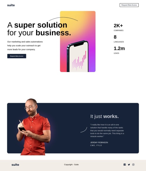
Solution retrospective
So a few things : 1). This is my first time using grid, so I believe that I should have used grid on everything not just the title top section. If someone can tell me if that was the move or I could still have done it another way.
-
I took a small break from coding so Im trying not to fall behind with the info I know so I was going on and off with this project and had a hard time with the page at 1440px so I made it look the best I could for now.
-
Last any tips would be great and much appreciated.
Code
Loading...
Please log in to post a comment
Log in with GitHubCommunity feedback
No feedback yet. Be the first to give feedback on Kevin Koziol's solution.
Join our Discord community
Join thousands of Frontend Mentor community members taking the challenges, sharing resources, helping each other, and chatting about all things front-end!
Join our Discord