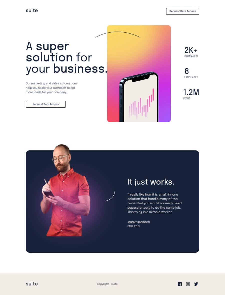
Suite Landing Page with great Position layouts
Design comparison
Solution retrospective
I found this to be extremely helpful for strengthening my position concepts. Now I feel that I have taken a nice challenge. It took me a while to complete this project.
Please log in to post a comment
Log in with GitHubCommunity feedback
- P@Minamakhlouf
Hi Syed,
Congratulations on the project.
I just have 2 pieces of advice that worked really well for me and I hope you find them useful as well.
-
You can better match the design by putting a <br> after the word "solution". Then give solution its own span element, give that span a display of inline-block. Then put the curved line image inside the span element. Then give the span element a relative position and give the curved image an absolute position above the word "solution" and a width of 100% so that it is always as big as the word it is above. That way, no matter how large or small the screen gets. The curved image will always be with the word solution in the header.
-
With display grid you can position elements so that they overlap and use z-index on them. It was very useful for me when I was positioning the hero image overlapping the header and it can help when you overlap the footer over the testimonials section.
Hope this feedback was helpful.
Congratulations on the project.
-
Join our Discord community
Join thousands of Frontend Mentor community members taking the challenges, sharing resources, helping each other, and chatting about all things front-end!
Join our Discord
