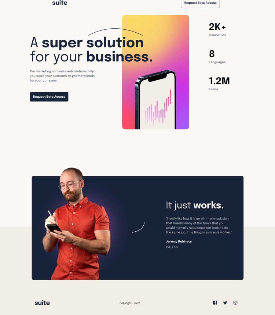
Design comparison
SolutionDesign
Solution retrospective
What are you most proud of, and what would you do differently next time?
I'm most proud of making the images adapt accordingly to their screen sizes for multiple devices.
What challenges did you encounter, and how did you overcome them?Picking suitable widths in rem units to display the image on tablet and mobile screens keeps the designs consistent. I overcame the challenge using MDN documentation and reading multiple sources to understand the concept.
What specific areas of your project would you like help with?I want feedback on my HTML structure for the first container having the heading, p, and a, with the digital image on why it won't stay in the desktop layout format on a tablet (the image goes under as if it's on mobile screens).
Community feedback
Please log in to post a comment
Log in with GitHubJoin our Discord community
Join thousands of Frontend Mentor community members taking the challenges, sharing resources, helping each other, and chatting about all things front-end!
Join our Discord
