Submit form using React Hook Form and Zod
Design comparison
Solution retrospective
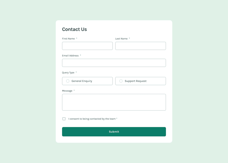
My first project using the React Hook Form library with Zod validation to create a modern and robust form.
Community feedback
- @TedJenklerPosted 7 months ago
Hi @DaniilGurski,
Nice job on the project! I haven't used React Hook or Zod yet, but I'm planning to try them out after I work on more projects with Formik.
One improvement to your code could be reducing the level of nesting. Many of your <div> elements and other tags create unnecessary nesting, which can be streamlined by using Flexbox. For example, the body could be a flex container with the form as its only child, and you can style the form’s children directly, eliminating the need for extra wrappers. Also, in React, you can use the <> </> (Fragment) tags to group elements without adding extra nodes to the DOM, which helps with accessibility and SEO.
Overall, great work—your project looks fantastic and is responsive!
Best, Teodor
Marked as helpful1@DaniilGurskiPosted 7 months ago@TedJenkler Thank you for your reply and advice ! I don't like HTML to be too nested myself, and perhaps I could make it cleaner. Just sometimes I want to add a gap between a couple of elements, so I wrap them in a div and add a flex / grid utility class on top of it which gives me easier access to the gap property.
Good luck learning React Hook form !
1@TedJenklerPosted 7 months agoThanks :) @DaniilGurski,
I usually use flex a lot, and as a rule, I always add the margin to the bottom of the element when the gap property isn’t "available"/ makes sense. As long as you're consistent, it makes it easier to find and change later. Plus, this approach helps avoid the margin collapse issue that can occur with certain elements.
1 - @iyedooPosted 7 months ago
Great job bro! It's always so interesting to build a project with a completely new tool! Well I have some hot takes on your project which is looking good and solid:
- Some space needed for the container because in desktop and phone version it is just sticking to the webpage border which ruins the beauty of that border radius effect. As a solution for that. I personally started reducing the gap between the (inputs) and the gap between (label and input)
- I like your updating error state. What I mean is when an error occures, it goes away once the problem is solved without needing to sumbit again. This is something I missed in my solution.
- The success popup is more than excellent... but It only needs some spacing from the top.
To conclude, I think the only thing you are missing is the designer thinking... how you manage spacing, sizes, margins etc... but still a solid 8/10 for a new React Hook project. Great job!
Marked as helpful1@DaniilGurskiPosted 7 months ago@iyedoo Thank you for your response man ! I appreciate it. Yes, the issue with the container not fitting on the entire page is something I definitely need to work on in my other projects. It's just that I always try to match the spacings and font sizes provided in the design, but maybe I should make exceptions.
0
Please log in to post a comment
Log in with GitHubJoin our Discord community
Join thousands of Frontend Mentor community members taking the challenges, sharing resources, helping each other, and chatting about all things front-end!
Join our Discord
