submit a message using pure-css


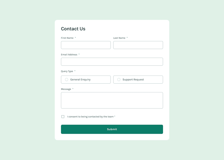
Design comparison
Solution retrospective
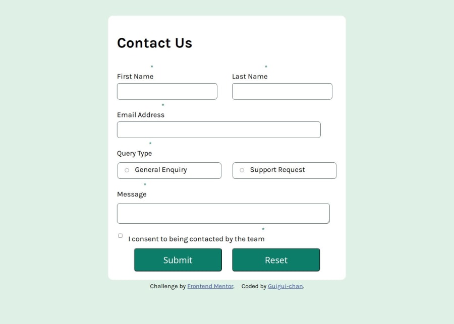
I had trouble setting up the border radius, the containers would aways look distorted. Overcame it by uploading the desktop-design.jpeg on Google Gemini and asking it to write a list of values I should put. It gave me a smaller and a less small value for each container, so, I decided to put the less small ones in the media querie. The values it gave were like "2px", I was previously using like "5%", so, no wander why the containers were looking like skate parks.
What specific areas of your project would you like help with?Reading this learning path articles was the very first time I came across the name "W.C.A.G.", so, I am as new I as could possibly be in this world. If anyone knows aria proprietys I should have used and did not, tell me, and etc.
Community feedback
- @rukhulkiromPosted 3 days ago
Hello there 👋. Good job on completing the challenge!
I have some suggestions about your code that might interest you.
- Improve Label Association
Your labels don't have for attributes pointing to inputs properly. Example:
<input type="radio" name="QueryType" id="GeneralEnquiryInput"> <label for="GeneralEnquiryInput">General Enquiry</label>- Your fieldset doesn't have a legend, making it less accessible for screen readers.
<fieldset>
  <legend>Query Type</legend>
  <label for="GeneralEnquiryInput">
    <input type="radio" name="QueryType" id="GeneralEnquiryInput"> General Enquiry
  </label>
  <label for="SupportRequestInput">
    <input type="radio" name="QueryType" id="SupportRequestInput"> Support Request
  </label>
</fieldset>
I hope you find it useful! Above all, the solution you submitted is great!
Happy coding!
Marked as helpful0

Please log in to post a comment
Log in with GitHubJoin our Discord community
Join thousands of Frontend Mentor community members taking the challenges, sharing resources, helping each other, and chatting about all things front-end!
Join our Discord