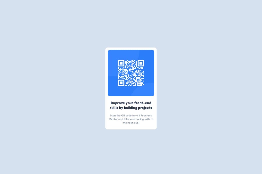
Design comparison
Solution retrospective
Fitting the image inside the card. It got me thinking for a while. Also, doing a project with the instructions because I've never attempted something like this. Created a readme for the first time:)
What challenges did you encounter, and how did you overcome them?I was really confused about what to pick b/w px, rem, em but this article https://fedmentor.dev/posts/font-size-px/ really helped me and also gave a perspective of why should we follow a particular workflow.
What specific areas of your project would you like help with?Do I have to calculate size something minor - like {letter-spacing: 0.03em}. Is it okay to have it this way or can I go with px in this one? Also, please give feedback on semantic html or css.
Community feedback
- @HushihaooooooPosted 6 months ago
It's good, but the small print is too close to the border.
0@ya55shPosted 6 months agoOh you mean the small text should have padding around? @Hushihaoooooo
0
Please log in to post a comment
Log in with GitHubJoin our Discord community
Join thousands of Frontend Mentor community members taking the challenges, sharing resources, helping each other, and chatting about all things front-end!
Join our Discord
