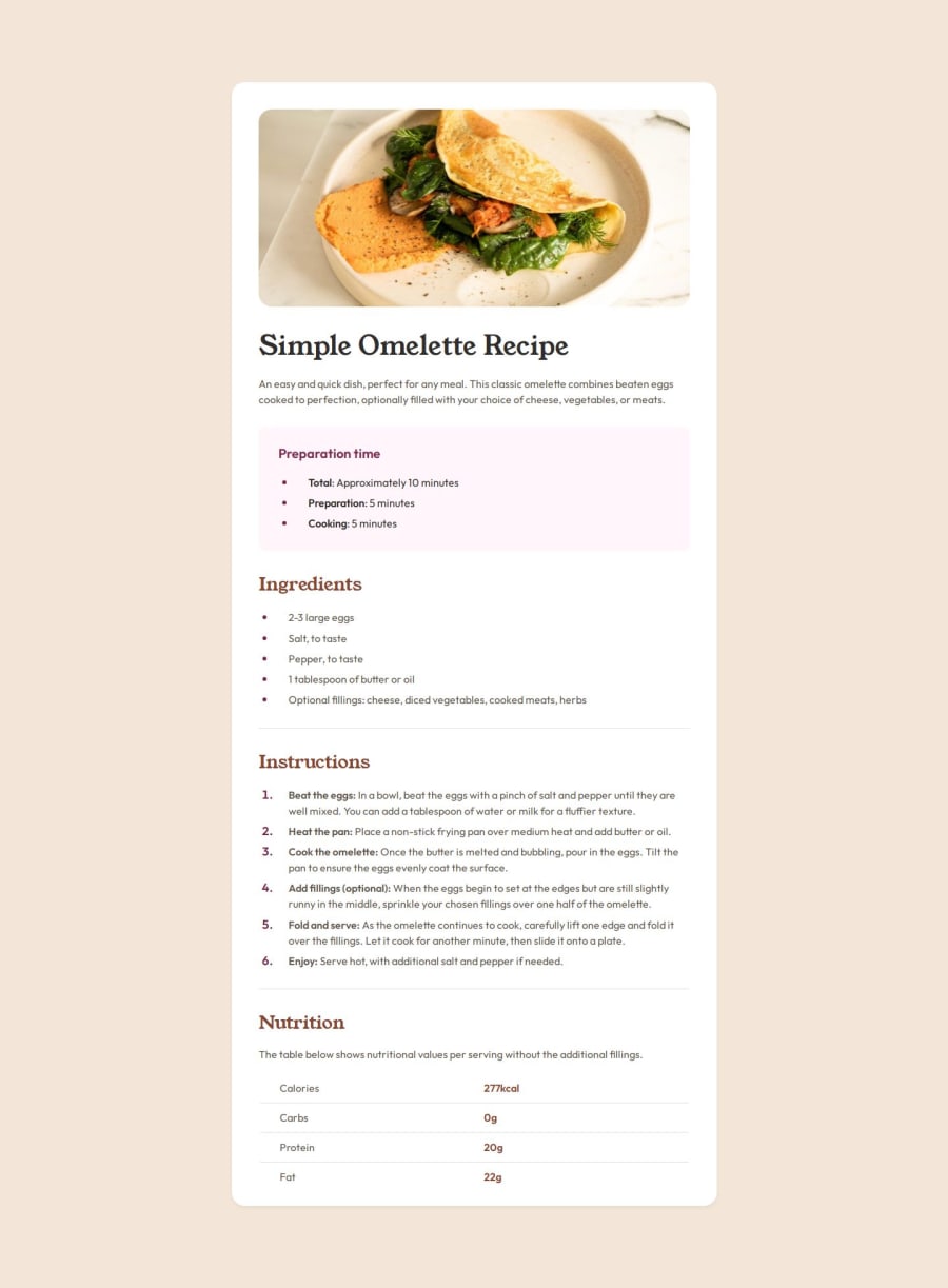
Stylish and Responsive Recipe Page


Design comparison

Solution retrospective
I'm particularly proud of implementing a customized list marker using the ::before pseudo-element for the first time, which added a unique touch to the design. Additionally, I ensured the use of semantic tags wherever possible to enhance accessibility. For future projects, I'd like to explore CSS Grid for more complex layouts, sass for styling and further improve accessibility with ARIA roles and better keyboard navigation.
What challenges did you encounter, and how did you overcome them?One significant challenge was working without a Figma design, which made achieving pixel-perfect implementation difficult. To overcome this, I used Diffchecker to compare screenshots and identify discrepancies. However, it was so challenging to repeatedly adjust styles and compare images. Despite this, I managed to achieve a cohesive design by carefully iterating on the visual details.
What specific areas of your project would you like help with?I would greatly appreciate feedback on the semantic structure of my HTML, code structure and any suggestions for improving accessibility. Additionally, advice on optimizing the performance of custom fonts would be very helpful.
Community feedback
Please log in to post a comment
Log in with GitHub
Join our Discord community
Join thousands of Frontend Mentor community members taking the challenges, sharing resources, helping each other, and chatting about all things front-end!
Join our Discord