styled-components

Solution retrospective
Hi! Is anyone interested in giving me feedback? I feel that I could improve a few shortcuts on my CSS or the JavaScript side.
-
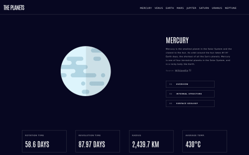
What did you find difficult while building the project? I learned how to make navigation and planet tabs in JavaScript files. I learned to construct CSS styled components. The challenging part is where I have to construct the structure of HTML and CSS for mobile, tablet and desktop. Keeping the design to flow through and not break out is difficult. Also, I had to look up several sources to make a function in planet-tabs.js doing two tasks. One is to switch paragraph to structure, and the other is hide and display the image.
-
Which areas of your code are you unsure of? I was unsure on the media max and min width. I tend to go for mobile-first, however, when I started on this project, it was built from desktop to mobile. I also confused on setting width and height of either p or a container. This is to allow the content to grow appropriately from a small to a large screen size.
-
Do you have any questions about best practices? What's the best community (I'm in Frontendmentor's Slack), Youtube channel or resources to ask questions when Google does not have answer to specific questions?
Please log in to post a comment
Log in with GitHubCommunity feedback
No feedback yet. Be the first to give feedback on Cacti's solution.
Join our Discord community
Join thousands of Frontend Mentor community members taking the challenges, sharing resources, helping each other, and chatting about all things front-end!
Join our Discord