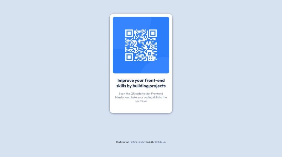


Design comparison

Solution retrospective
What are best practices for measurements? px, rem, %, etc?
Community feedback
- @kaiser-sbPosted about 1 year ago
Hey Emily,
Great job completing your first project! Regarding best practices - it all depends on the context and layout in which you're using it. E.g. - for font sizes, it's better if you could use
rem. This helps in case you change the root font size in thehtmlpart - you get the proportionate change in whole layout. For margins, you can use percentage orpx- depending on whether you want a proportionately changing layout or a fixed measurement.For width and heights, you can combine both by using percentage values and setting a
max-width,max-height,min-widthormin-heightto get a fine layout. Also, you can usevworvh- to size your elements according to viewport width or height. So it's all about mix and match and using them depending on where and how you wish them to place. Hope this helps. Happy coding!Marked as helpful0 - @DigitaleWeltLibraryPosted about 1 year ago
Hello, good solution.
I would only adjust this line like this. Then you won't have a problem if the screen gets smaller.
.qr-container {
    width: min(90%, 300px);
}
Happy coding
0


Please log in to post a comment
Log in with GitHub
Join our Discord community
Join thousands of Frontend Mentor community members taking the challenges, sharing resources, helping each other, and chatting about all things front-end!
Join our Discord