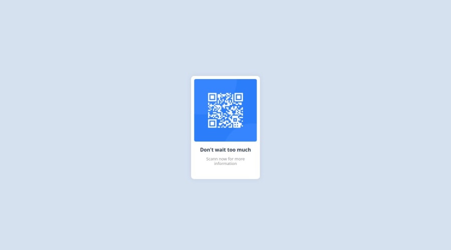
Design comparison
Solution retrospective
I am proud of the style of the content I may be add some colors and decoration next time
What challenges did you encounter, and how did you overcome them?i encountred some problems in the external css link and be solved by editing the link itself
What specific areas of your project would you like help with?may be putting the content inside a box
Community feedback
- @marc115Posted about 1 year ago
To put the content inside a box, you should wrap your content inside a <div> element and give it a class name like so:
<div class="box">
...
</div>
And from there, you should be able to define all of its properties in CSS like this:
.box {
    ...
}
Among the properties that you'll need are one to make the background white, another one for padding, making the box have rounded corners, and make it align its elements vertically in a column.
Marked as helpful1 - @DorKatzirPosted about 1 year ago
Hi, i've looked in your code and made some changes.
In the Html file put everything inside a
divand give it a class of.box:<div class="box"> <img class="image" src="images/image-qr-code.png" alt="QR image"> <div class="text"> <h1>Don't wait too much </h1> <p>Scann now for more information</p> </div> </div>In the CSS file import the font from google fonts and use this font in the body:
@import url('https://fonts.googleapis.com/css2?family=Poppins&display=swap');

body{
    font-family: "Poppins", sans-serif;
    font-weight: 400;
    font-style: normal;
    background-color: rgb(214, 225, 240);
}
Now... to put the box in the center of the page verticly and horizontaly, Set the body
height: 100dvh;anddisplay: grid;and alsoplace-items: center;
give the.boxclass width and height and give the image width of 100% so it will be inside the box without overflowing outside the box.This is my final CSS Code file:
@import url('https://fonts.googleapis.com/css2?family=Poppins&display=swap');

body{
    font-family: "Poppins", sans-serif;
    font-weight: 400;
    font-style: normal;
    background-color: rgb(214, 225, 240);
    display: grid;
    height: 100dvh;
    place-content: center;
    overflow: hidden;
}

.box{
    width: 200px;
    height: 310px;
    background-color: #fff;
    border-radius: 10px;
    padding: 10px;

    box-shadow: 0px 0px 15px rgb(46 57 77 / 0.1);
}

.image{
    width: 100%;
    height: auto;
    border-radius: 5px;
}

.text{
    padding: 10px;
}

h1{
    text-align: center;
    font-size: 16px;
    margin-top: 0;
    color: #2d384b;
}

p{
    text-align: center;
    font-size: 13px;
    line-height: 15px;
    margin-top: 0;
    margin-bottom:0;
    color: #909092;
}
Take it and play with it - I hope you like it 🚀😉
Marked as helpful0
Please log in to post a comment
Log in with GitHubJoin our Discord community
Join thousands of Frontend Mentor community members taking the challenges, sharing resources, helping each other, and chatting about all things front-end!
Join our Discord
