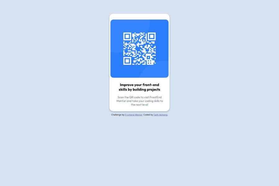
Structured Card layout with HTML and Style it with CSS
Design comparison
Solution retrospective
I am proud of doing my own work and not using any generative AI to find solutions to the problems I faced. Next time I will try to code faster because in this simple project I took a lot of time.
What challenges did you encounter, and how did you overcome them?Setting the margin for the card I used was a challenge, the card was not in the right place. I overcame this challenge by asking a friend for assistance.
What specific areas of your project would you like help with?How to easily adjust the position of the images and setting the right Margin.
Community feedback
- @marliedevPosted 21 days ago
Hi! So to Center Things insofern a wrapper - in this case the card inside the body - you can usw flexbox. To get a better result to the given Design use a adjuated padding.
body{
    background-color: hsl(212, 45%, 89%);
    display:flex;
    justify-content: center;
    align-items: Center;
}
.card{
    box-shadow: 0 4px 8px 0 rgba(0, 0, 0, 0.2);
    max-width: 300px;
    text-align:center;
    background-color:#fff;
    border-radius: 20px;
    padding:1rem;
}
0
Please log in to post a comment
Log in with GitHubJoin our Discord community
Join thousands of Frontend Mentor community members taking the challenges, sharing resources, helping each other, and chatting about all things front-end!
Join our Discord
