Submitted 6 months ago
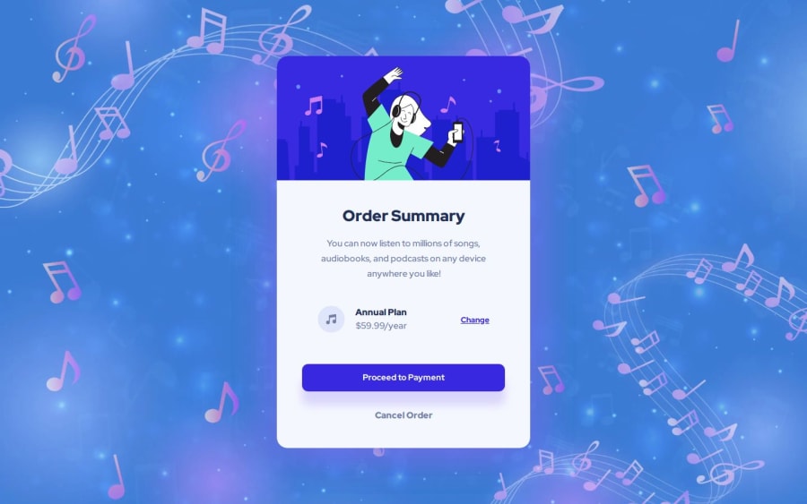
Streamlined Order Summary with HTML & SCSS
#sass/scss
@Grimm-N
Design comparison
SolutionDesign
Solution retrospective
What are you most proud of, and what would you do differently next time?
I managed to build this card pretty quickly... that is, when I'm not giving myself extra tasks along the way! 😅
What challenges did you encounter, and how did you overcome them?I couldn't figure out the hover color for the button at first, but Photoshop's eyedropper tool saved the day in no time! 🎨✨
What specific areas of your project would you like help with?I’m happy to receive any feedback and suggestions for optimizing and improving the code! Always looking to learn and grow. 💡
Community feedback
Please log in to post a comment
Log in with GitHubJoin our Discord community
Join thousands of Frontend Mentor community members taking the challenges, sharing resources, helping each other, and chatting about all things front-end!
Join our Discord
