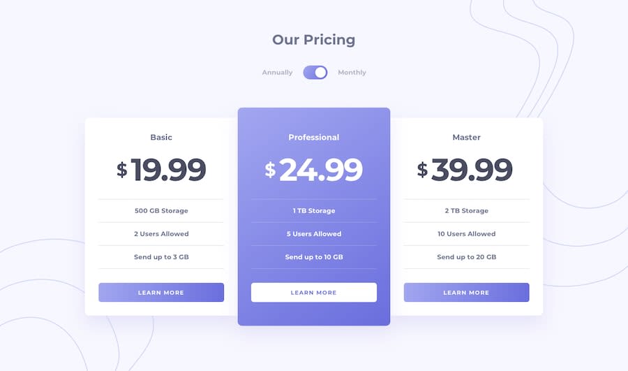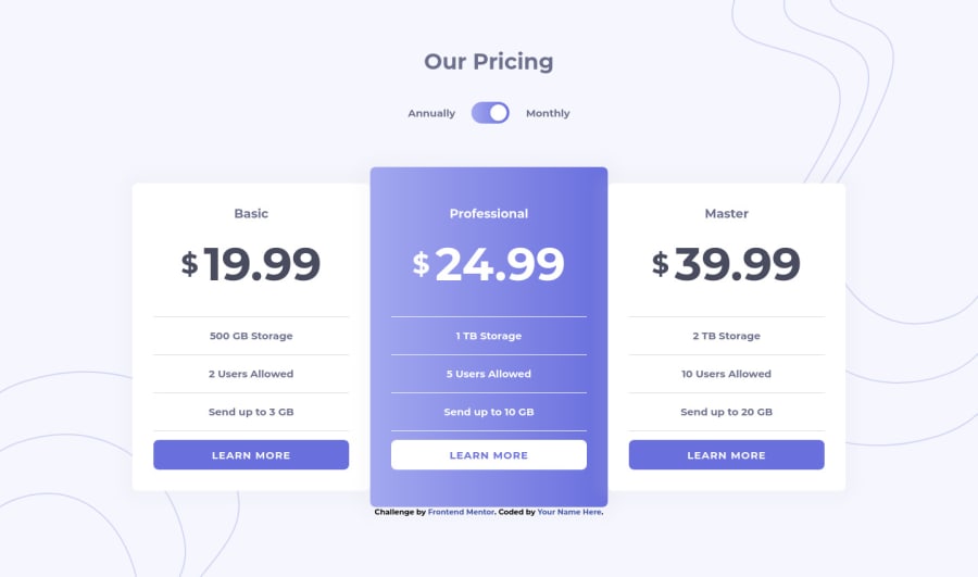
Design comparison
Solution retrospective
Hello, this is refactored version of my first attempt.
Changed the toggle to what Grace suggested and it is really awesome. So a huge thank you Grace! Also for APG for pointing out that toggle at first, always keen in the eyes.
Thank you for seeing the solution. If you need help on it, just drop your query^^
Community feedback
- @grace-snowPosted almost 4 years ago
Hey @Pikamart
On this one, because the toggle needs to have two labels, I recommend using radio inputs to make it accessible. Essentially, that's what this toggle is - it's two labelled choices and you always have to choose one, exactly the same as a set of radios.
If a toggle is an on/off or only has one label, that's the only time I might use a checkbox for it (with the checked state matching the visible label). All other times a set of radios is definitely more understandable.
It's important not to use display none to hide interactive elements as that removes them completely from the accessibility tree. Instead use properties like height and opacity.
Make sure you add visible focus states to all interactive elements too. I can't navigate around this on my keyboard at the moment.
Take a look at my solution if you need some help with the toggle.
Good luck :)
2@pikapikamartPosted almost 4 years ago@grace-snow Thank youu and I checked your solution and it really is interactive even when using keyboards and yes, the radio buttons is definitely the best choice in here, at first I thought of using it then I think that, how can I make use of one radio button and why didn't I think of two radio buttons (haha). Also I did not know that displaying none makes element not accessible since they still have their functionality but like what you said, it removes the accessibility. Thank you for that^^
0 - @ApplePieGiraffePosted almost 4 years ago
Hey, Raymart Pamplona! 👋
It's great to see you completing so many challenges! 😃 Well done on this one! 👍
I suggest,
- Adding
min-height: 100vh
to thebody
to ensure that it is always at least as high as the viewport (and that way, there won't be any empty space between the background image in the bottom-left corner of the page and the bottom edge of the screen). - Adding a little bit of space between the pricing cards and the sides of the page (using margin/padding) so that there's some room between the two and they aren't touching each other when the width of the screen decreases in the desktop layout.
- Making the toggle-switch tabbable so that users can change the prices of the pricing cards with their keyboard.
- Perhaps add your name to the attribution at the bottom! 😉
Hope those tips help. 🙂
Keep coding (and happy coding, too)! 😁
2@pikapikamartPosted almost 4 years ago@ApplePieGiraffe Thank you for that and upon seeing my code again, I realized that I set a
height
on my body and it made my layout capped on mobile view hahaha thank you for that and yes that padding is really helpful. I rely only to the flexbox for centering them and forgot that padding helps to prevent them touching the screen. Thank you and will refactor code ^^1@pikapikamartPosted almost 4 years ago@ApplePieGiraffe And also, how can I make my element be tab-able without declaring them in
a
tag?0@pikapikamartPosted almost 4 years agoFinished refactoring the code^^ (But still not tab-able the toggle)
0@ApplePieGiraffePosted almost 4 years ago@pikamart
Hm... I sometimes have a little trouble with making elements tabbable, myself (IDK why). 😅 Perhaps wrap the toggle-switch in a button? I suggest taking a look at grace-snow's feedback, though, and her solution for this challenge (as it has many accessibility best-practices). 😉
0 - Adding
Please log in to post a comment
Log in with GitHubJoin our Discord community
Join thousands of Frontend Mentor community members taking the challenges, sharing resources, helping each other, and chatting about all things front-end!
Join our Discord