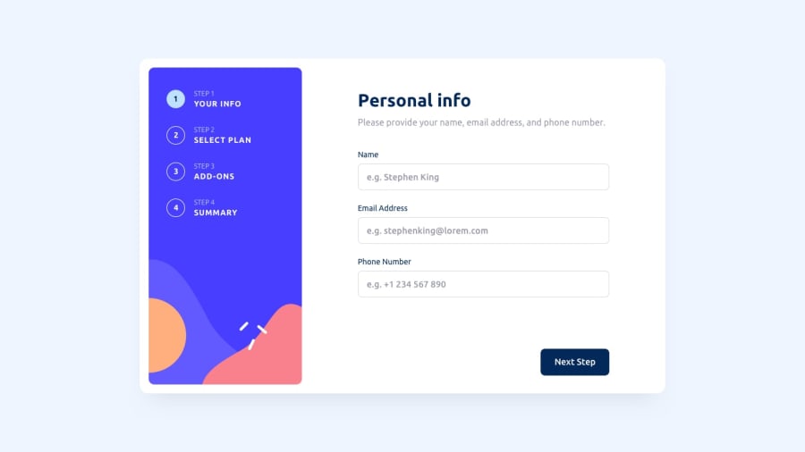
Design comparison
SolutionDesign
Solution retrospective
Ok, so I think I was a lot careful designing this one. But I'm sure there maybe some errors here and there; after all, I am only showing it to others for first time. An opinion will be greatly appreciated. My money is on no errors in this project. I mean I was very careful but I won't know for sure until someone else checks it out. Thanks for helping me make this better.
Community feedback
- @Aimal-125Posted over 1 year ago
In your css code, increase the height of 120 or 150vh by using media query with
max-height: 400px;so that your web app looks good on small heighted screens as mine samsung j3.Marked as helpful0
Please log in to post a comment
Log in with GitHubJoin our Discord community
Join thousands of Frontend Mentor community members taking the challenges, sharing resources, helping each other, and chatting about all things front-end!
Join our Discord
