


Design comparison


Solution retrospective
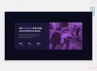
This one took quite a bit more time... Although it was fun!
Areas I had a hard time with:
- Positioning. Sometimes the text goes off center and at times padding won't work.
- Mobile version. In the mobile version, the color I used on the picture went off the picture a bit and I was unsure what caused that. There were also alignment issues...
Feedback is greatly appreciated, please! Thank you :)
Community feedback
Please log in to post a comment
Log in with GitHub
Join our Discord community
Join thousands of Frontend Mentor community members taking the challenges, sharing resources, helping each other, and chatting about all things front-end!
Join our Discord